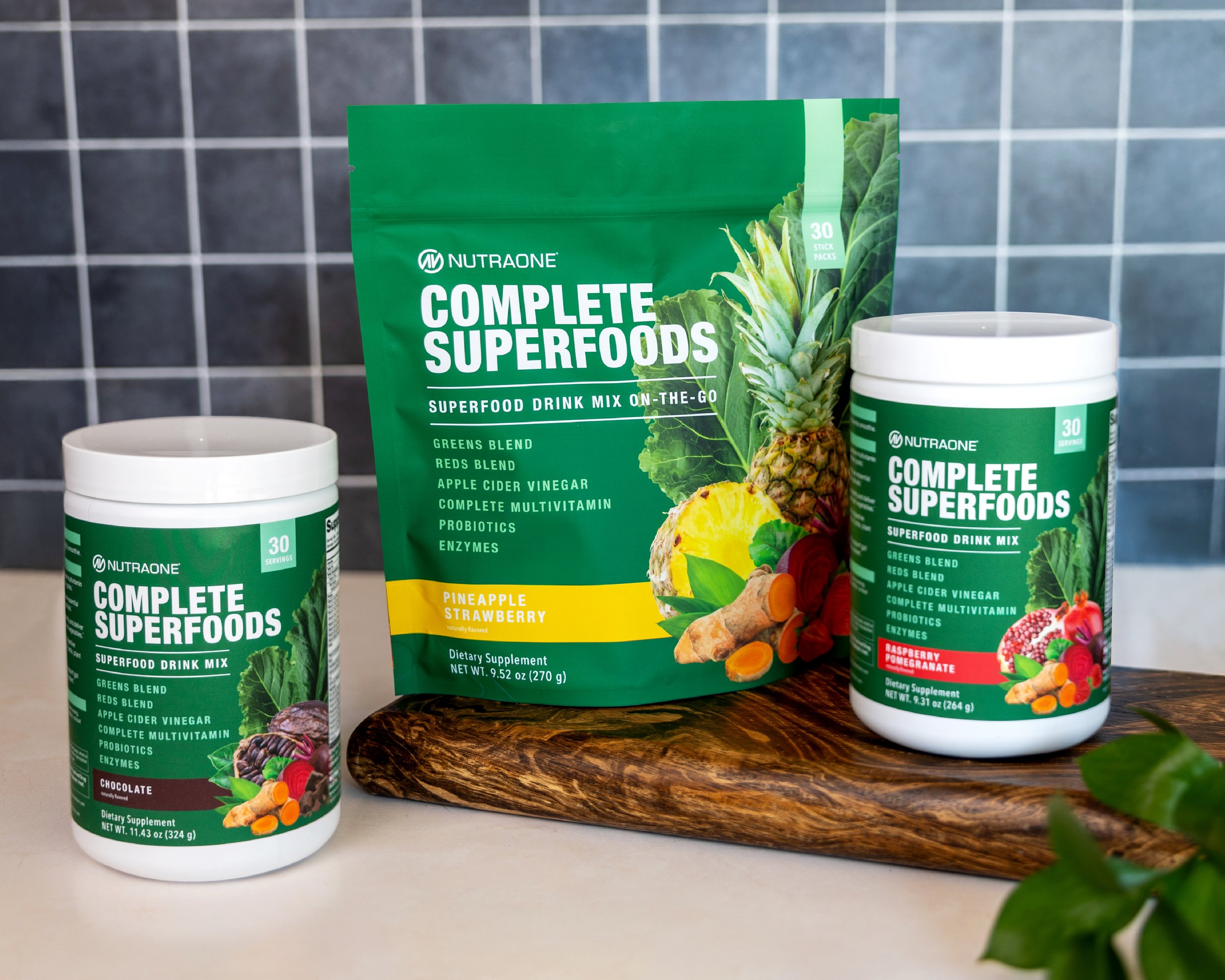
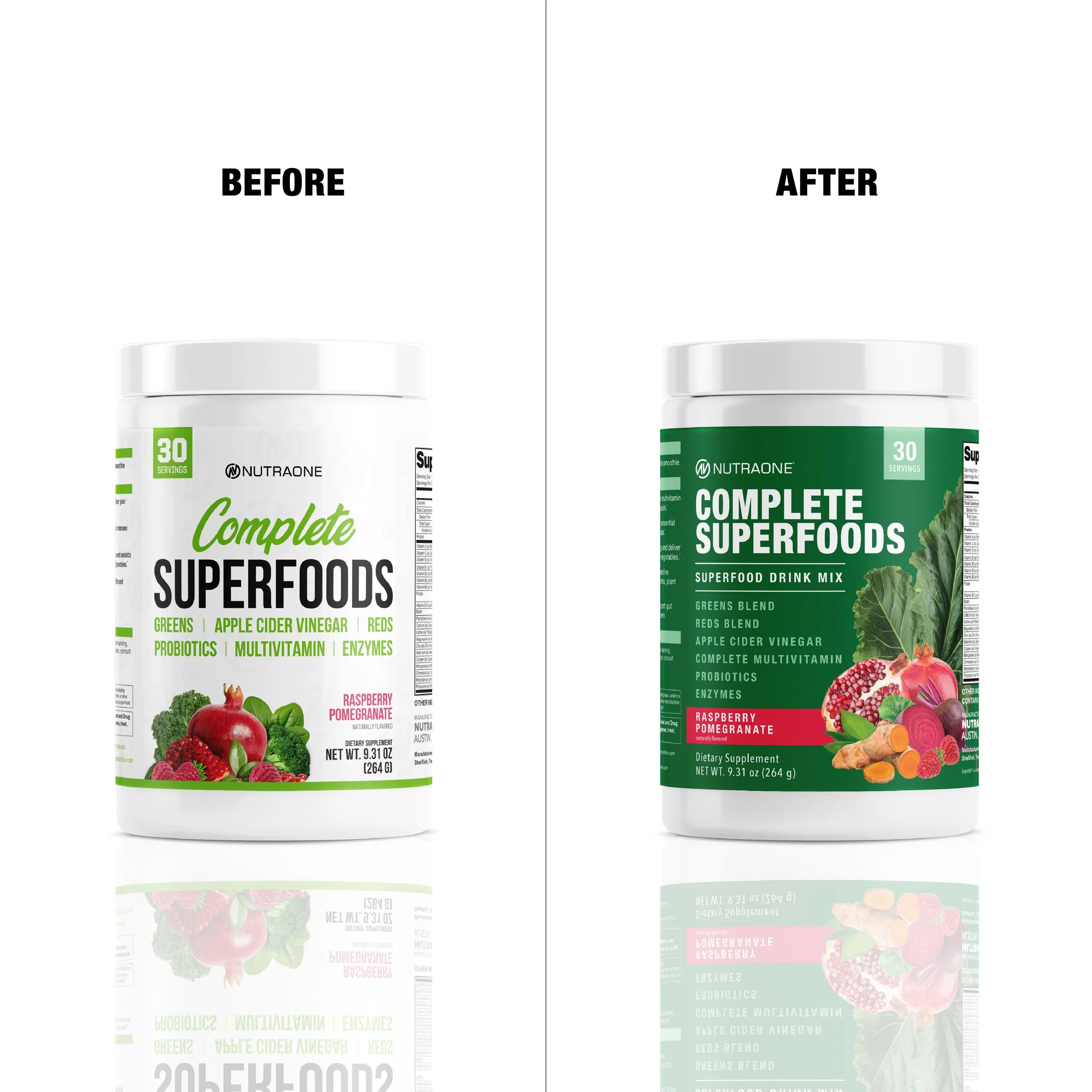
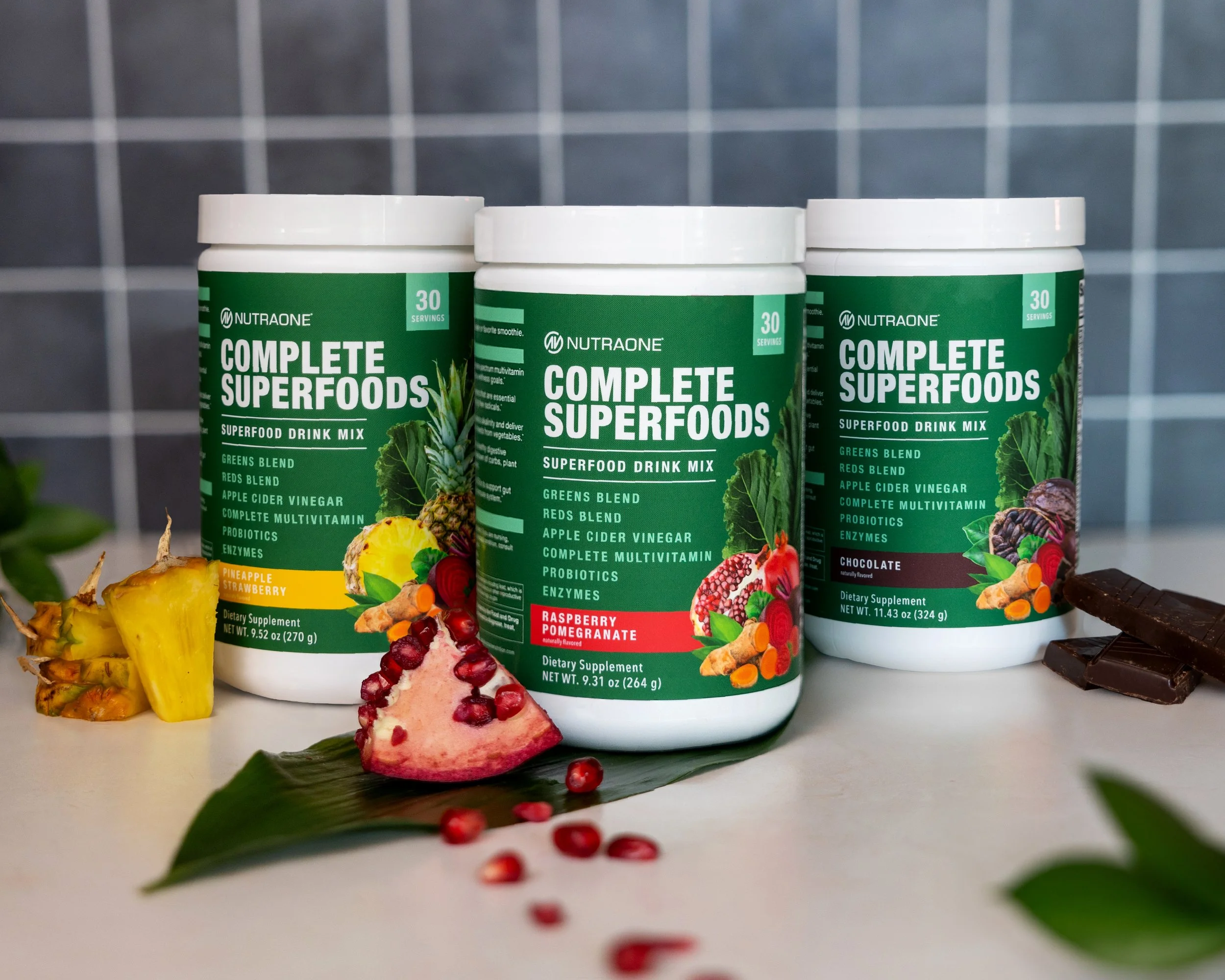
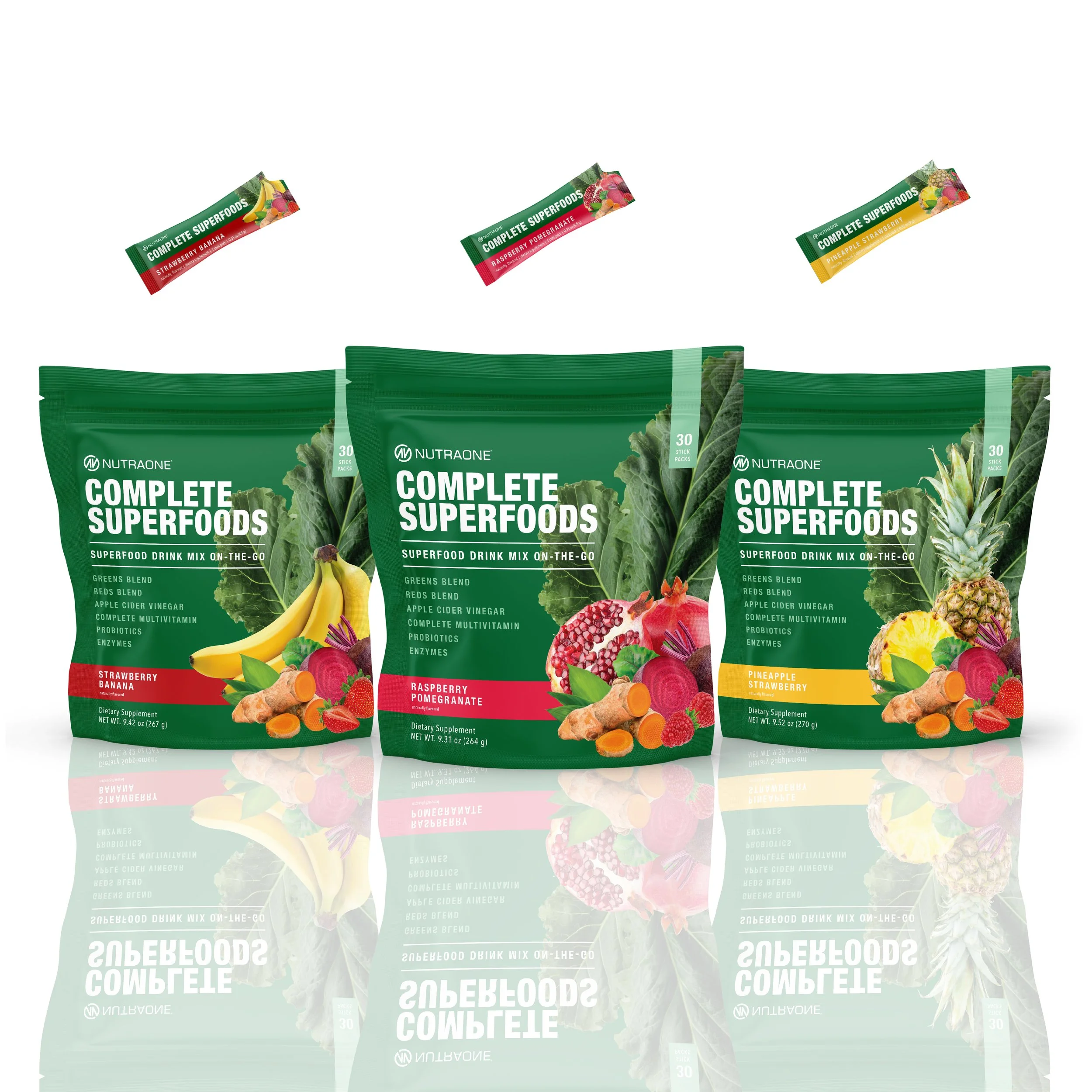
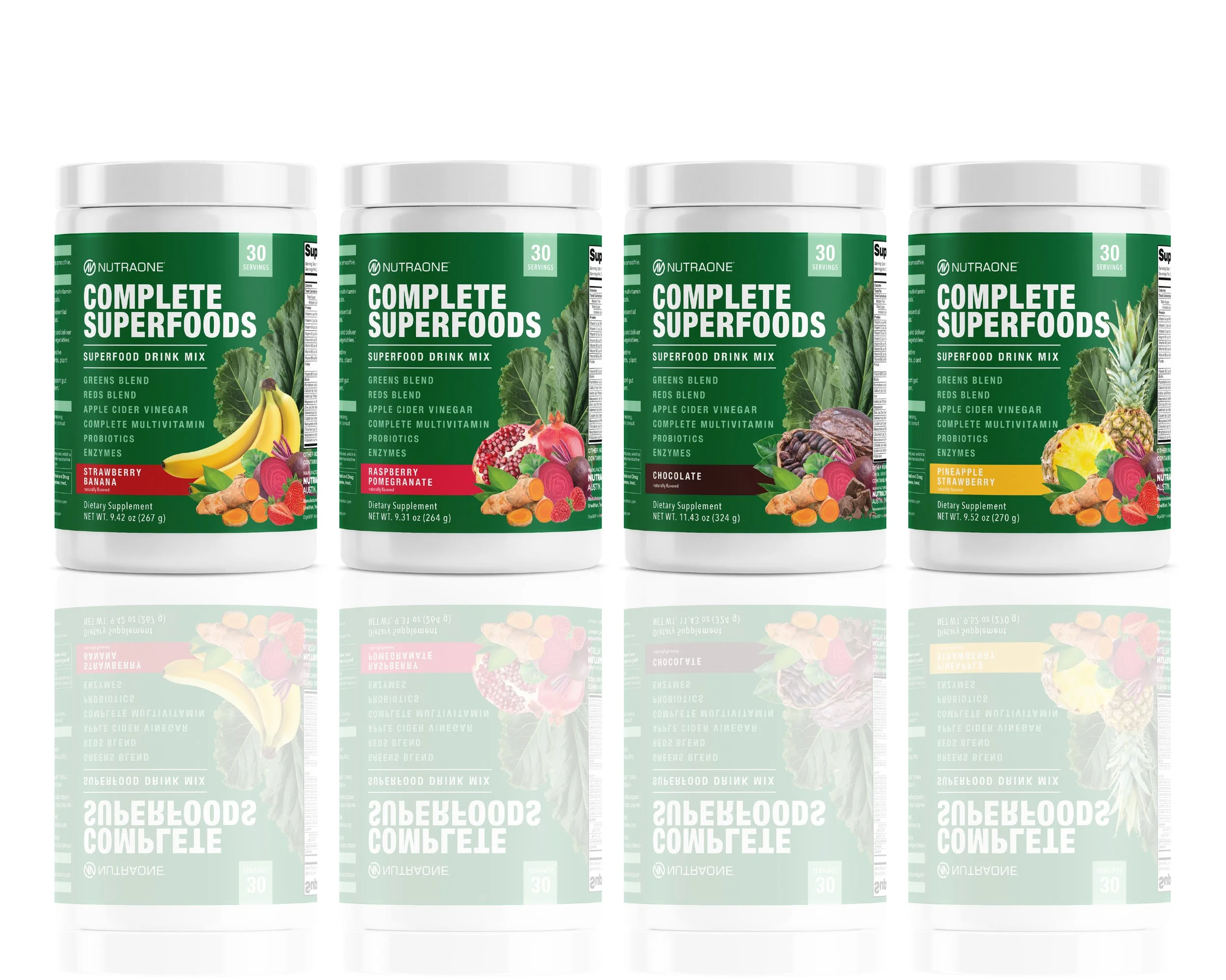
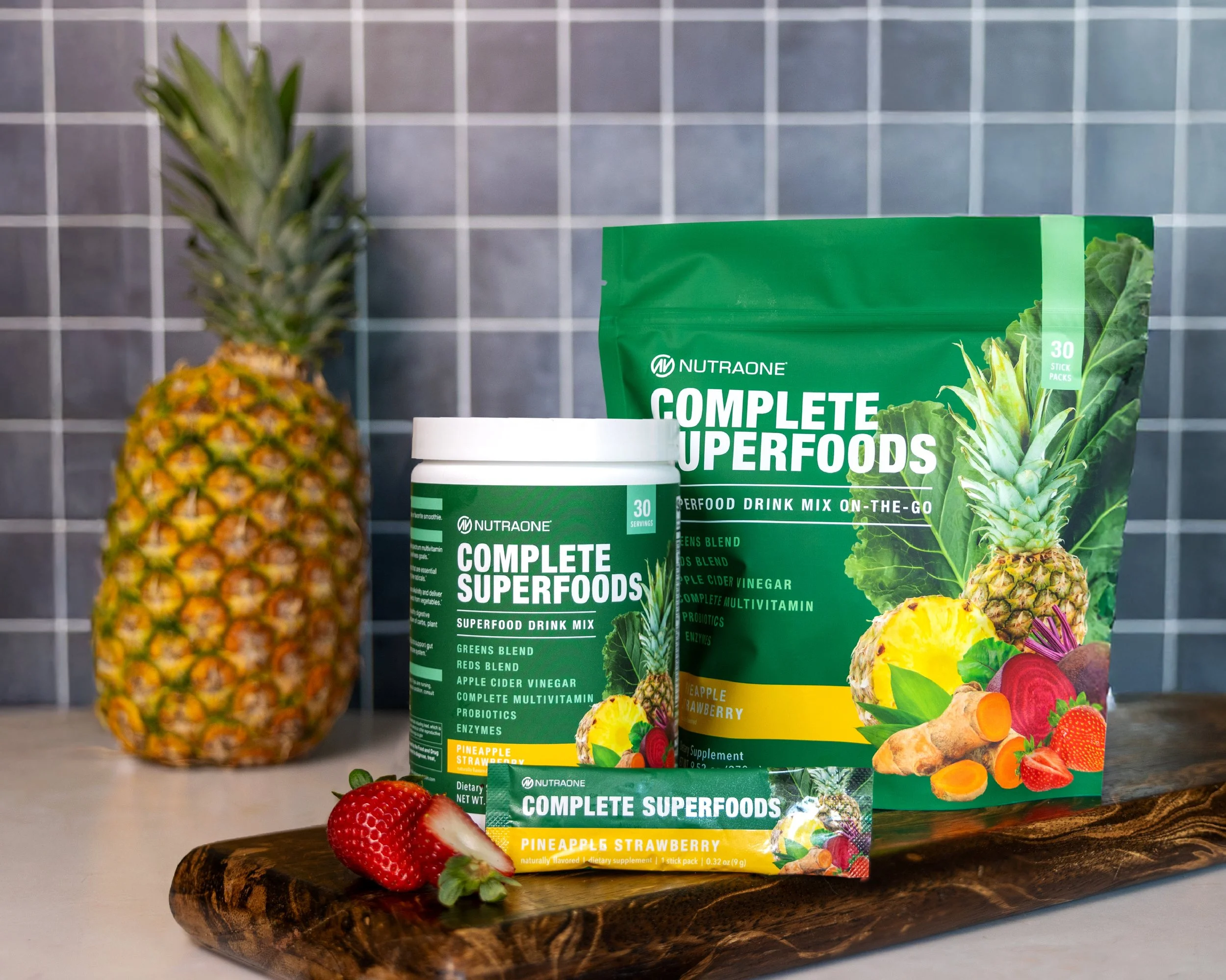
We had one flavor of Complete Superfoods, and I was tasked to not only give it a fresh new look, but also create a stand-up pouch with stick packs to give our customers an on-the-go option. We also expanded the product to include three additional flavors. This was such a fun project to work on, and the final result was a hit.
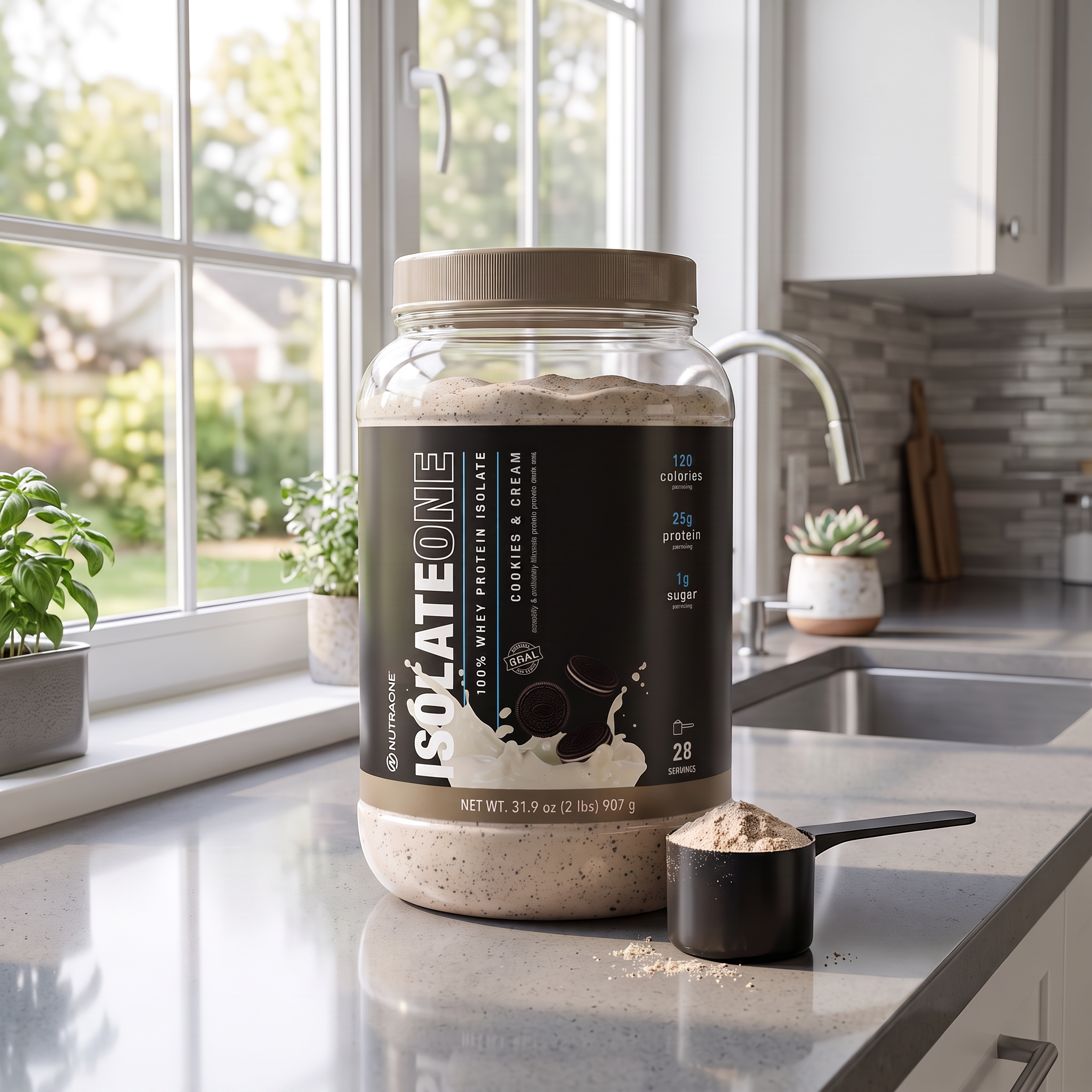
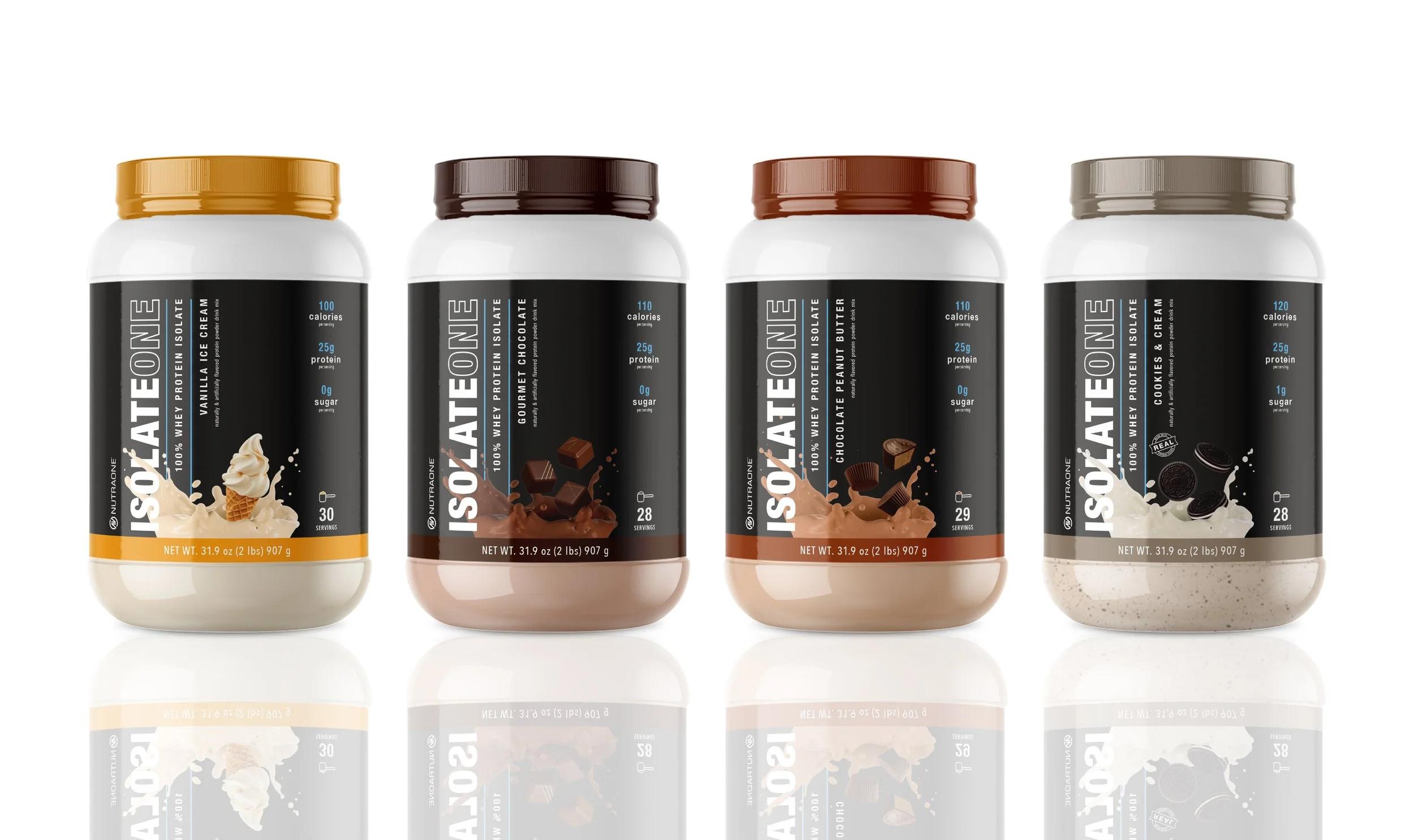
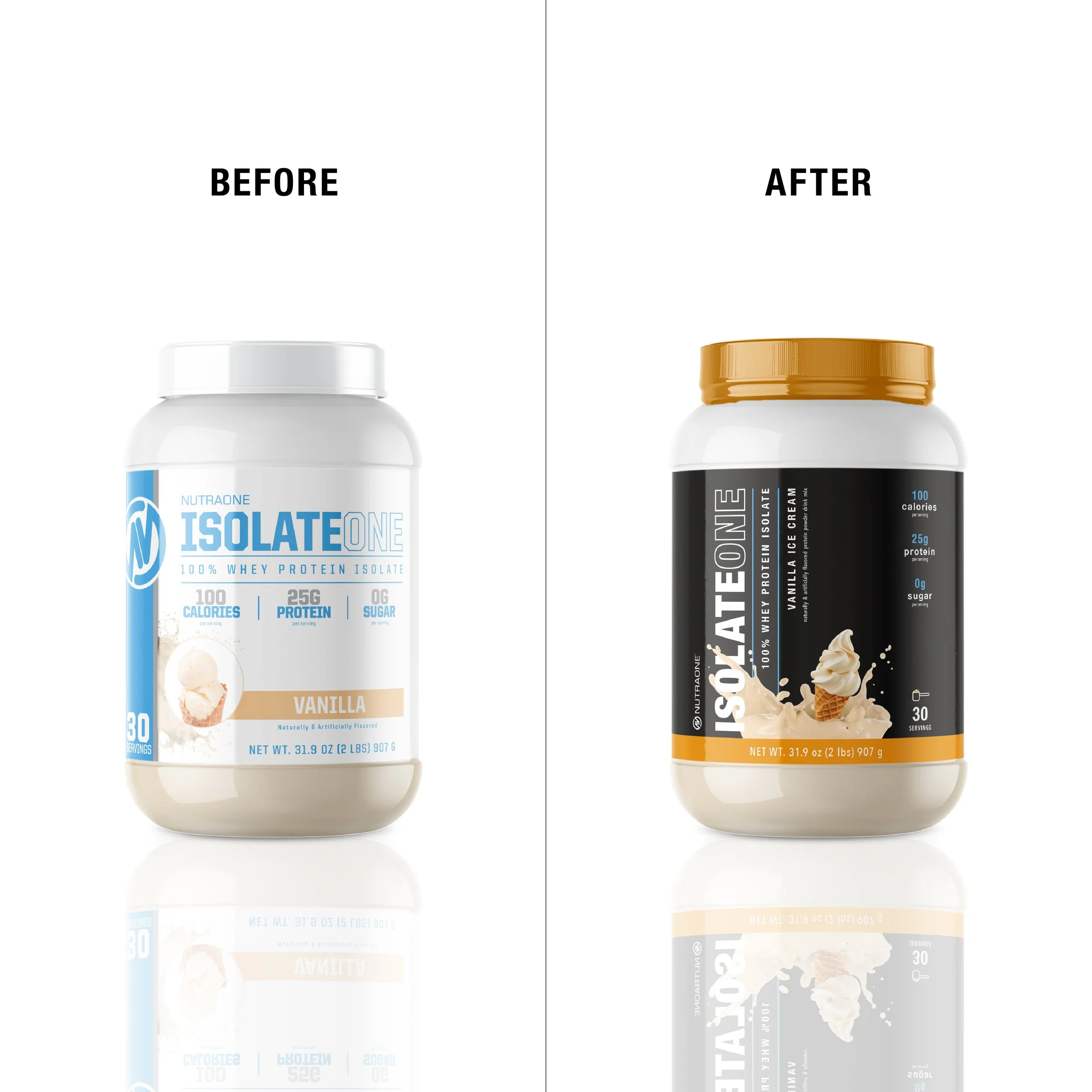
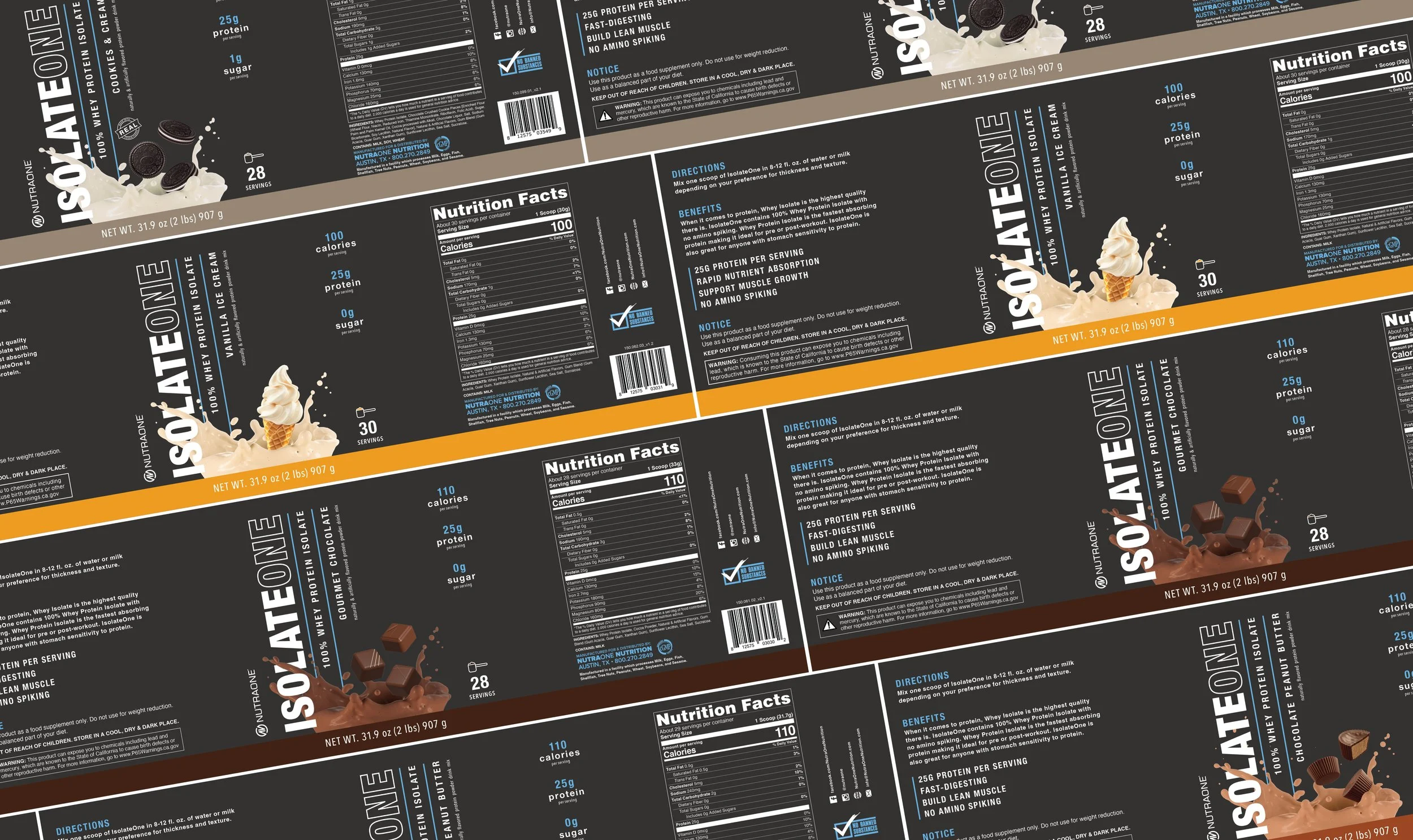
IsolateOne was one of our best-selling proteins, but the label was pretty outdated, so I got the opportunity to revamp this label with a bold new look. I enjoyed creating the flavor splashes for each flavor, and having the splash overlap the lettering made the label really feel modern and fun. The blue accent color also got a metallic treatment to contrast nicely on the dark background.
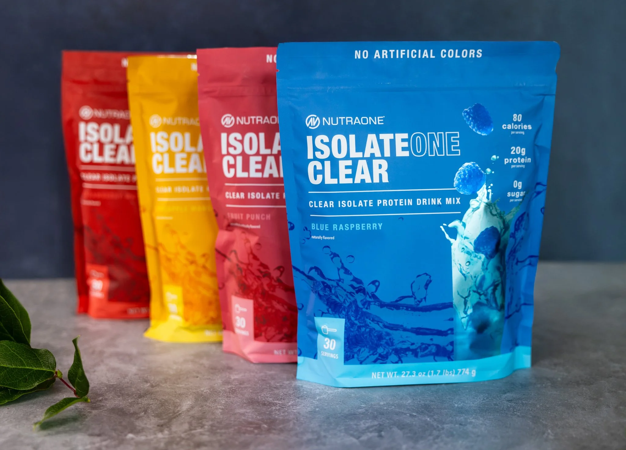
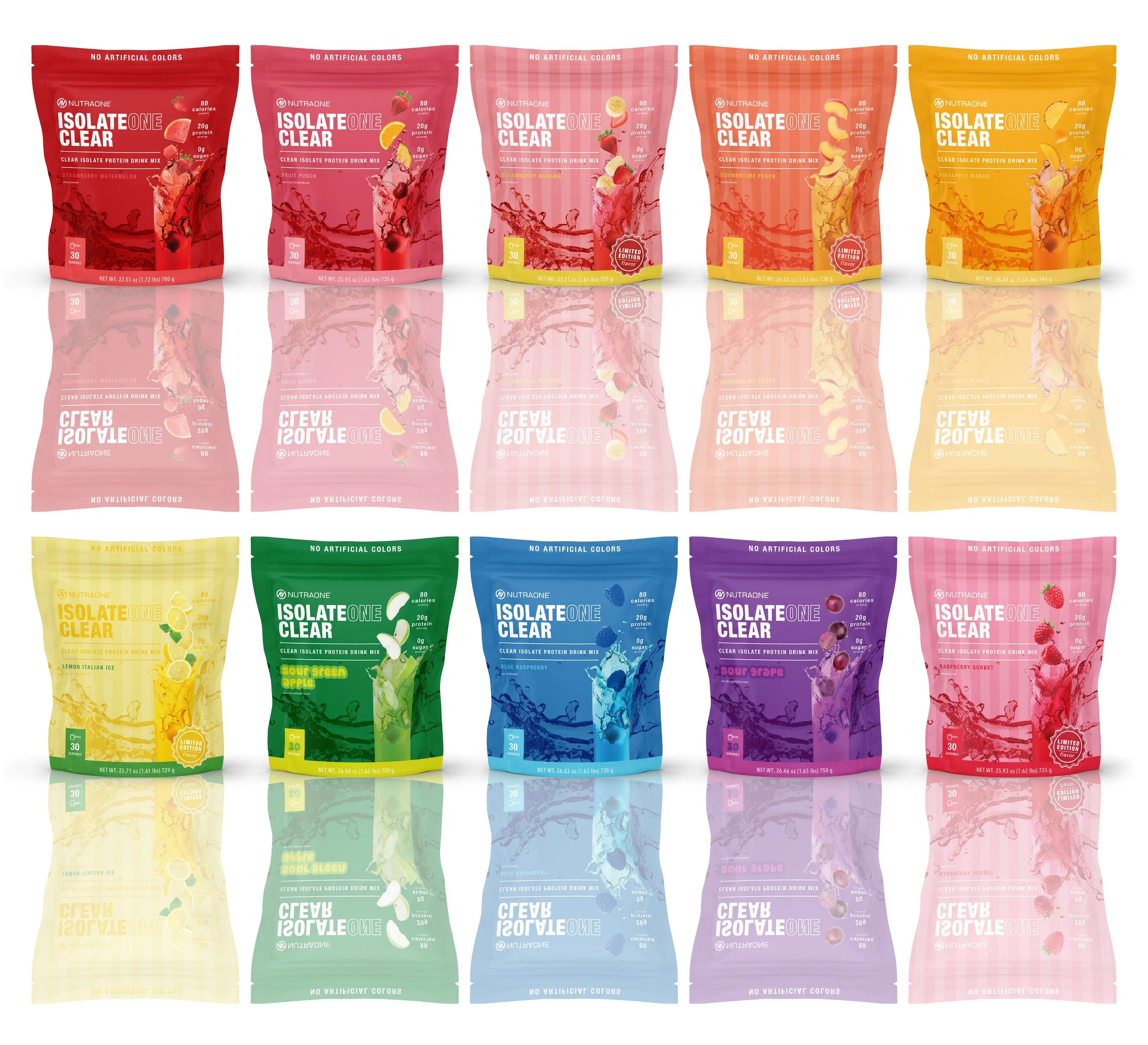
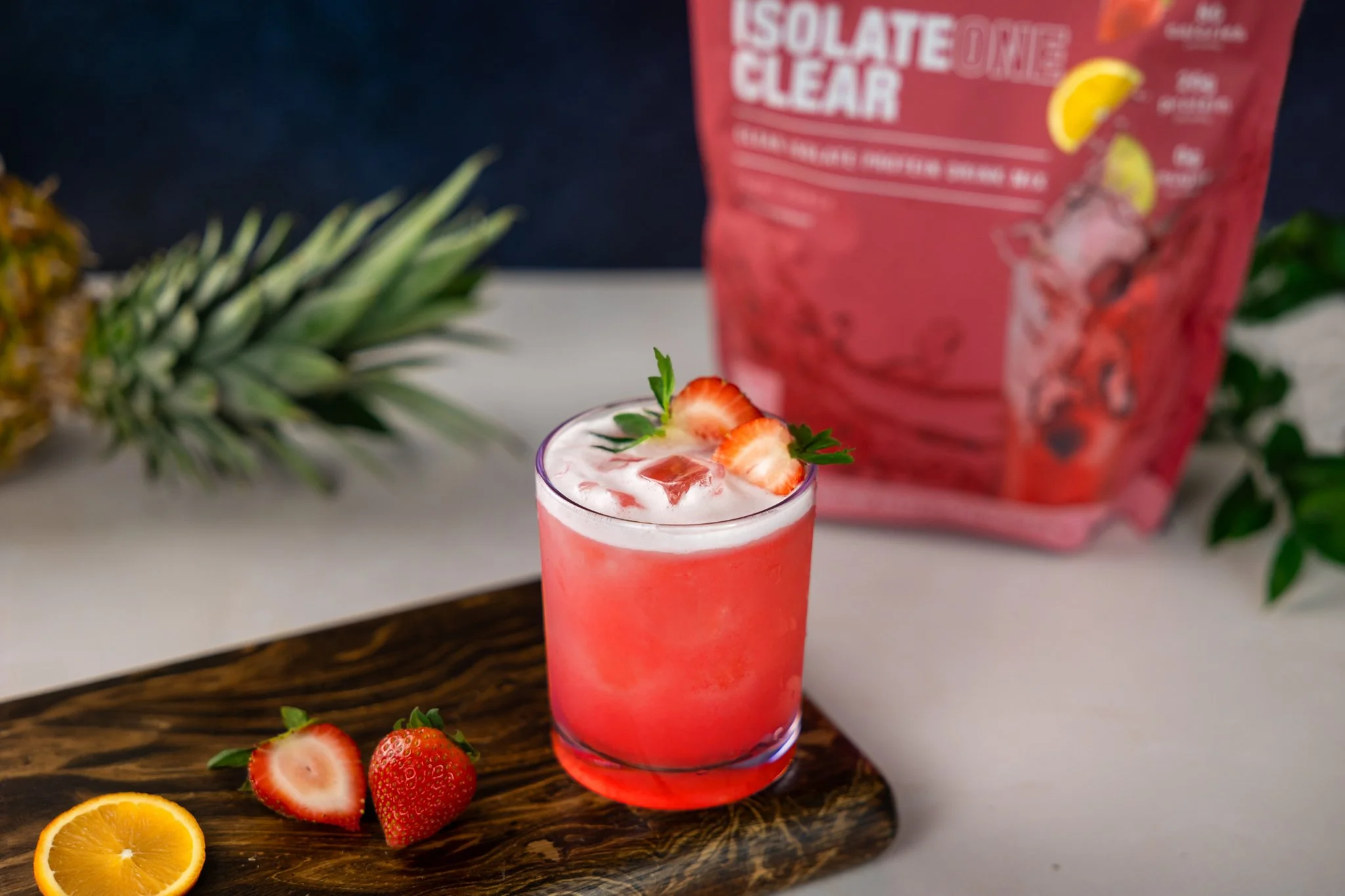
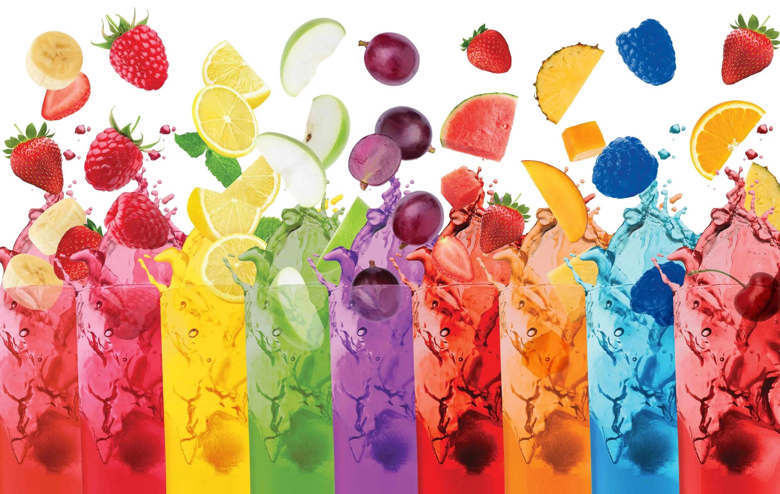
IsolateOnce clear was a new take on protein: a light and refreshing drink rather than a milky shake. This protein came in stand-up pouches and we started off with 4 flavors initially. Then we added two sour flavors and some seasonal “limited edition” flavors. I really enjoyed the challenge in giving each flavor it’s own design and color scheme, while maintaining cohesiveness across the line.
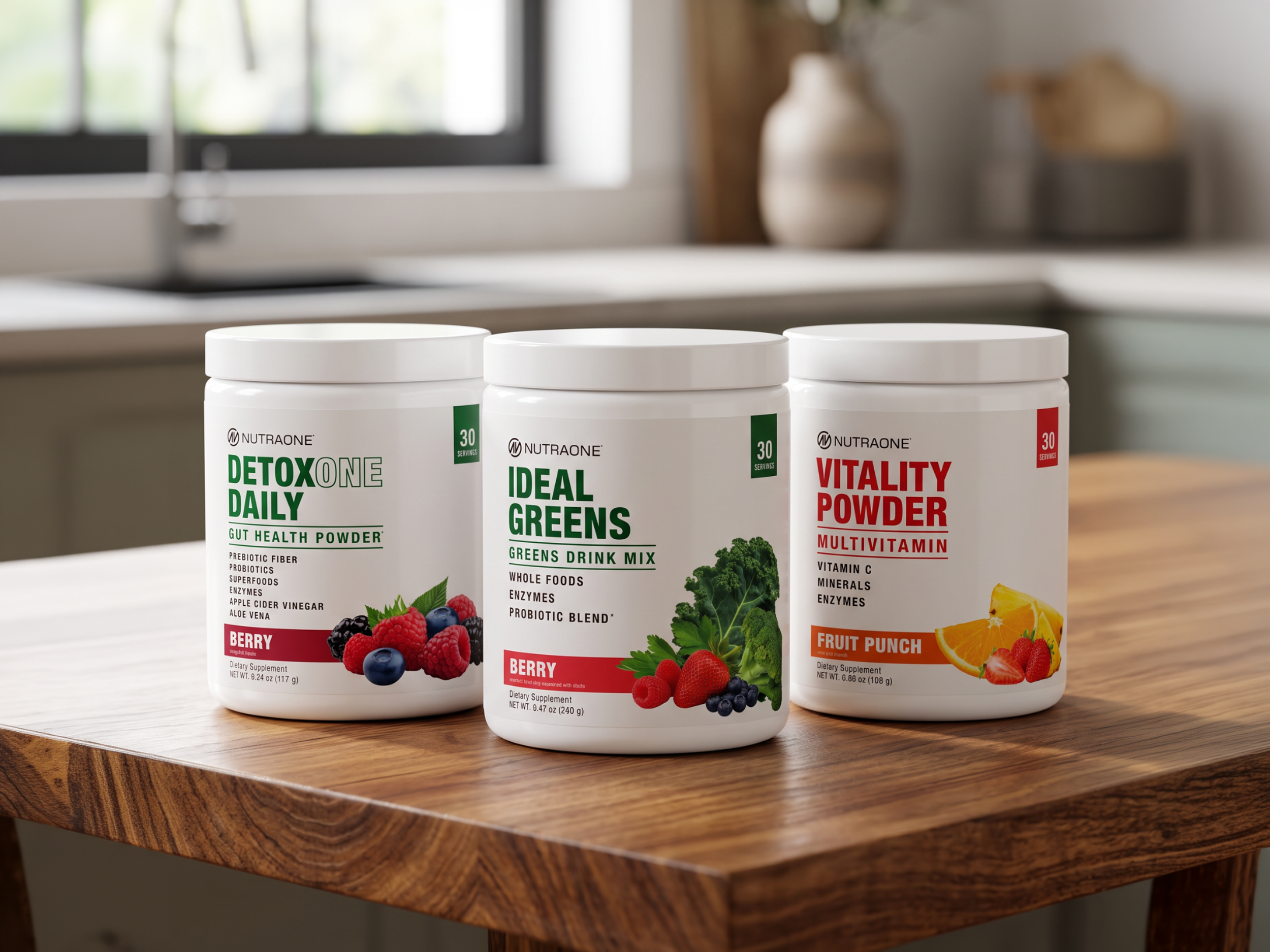
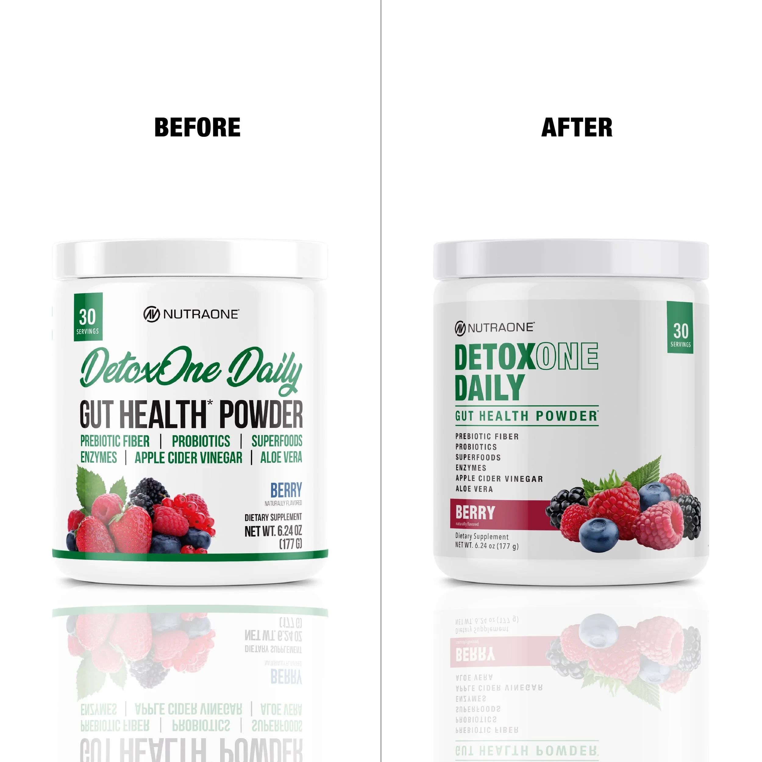
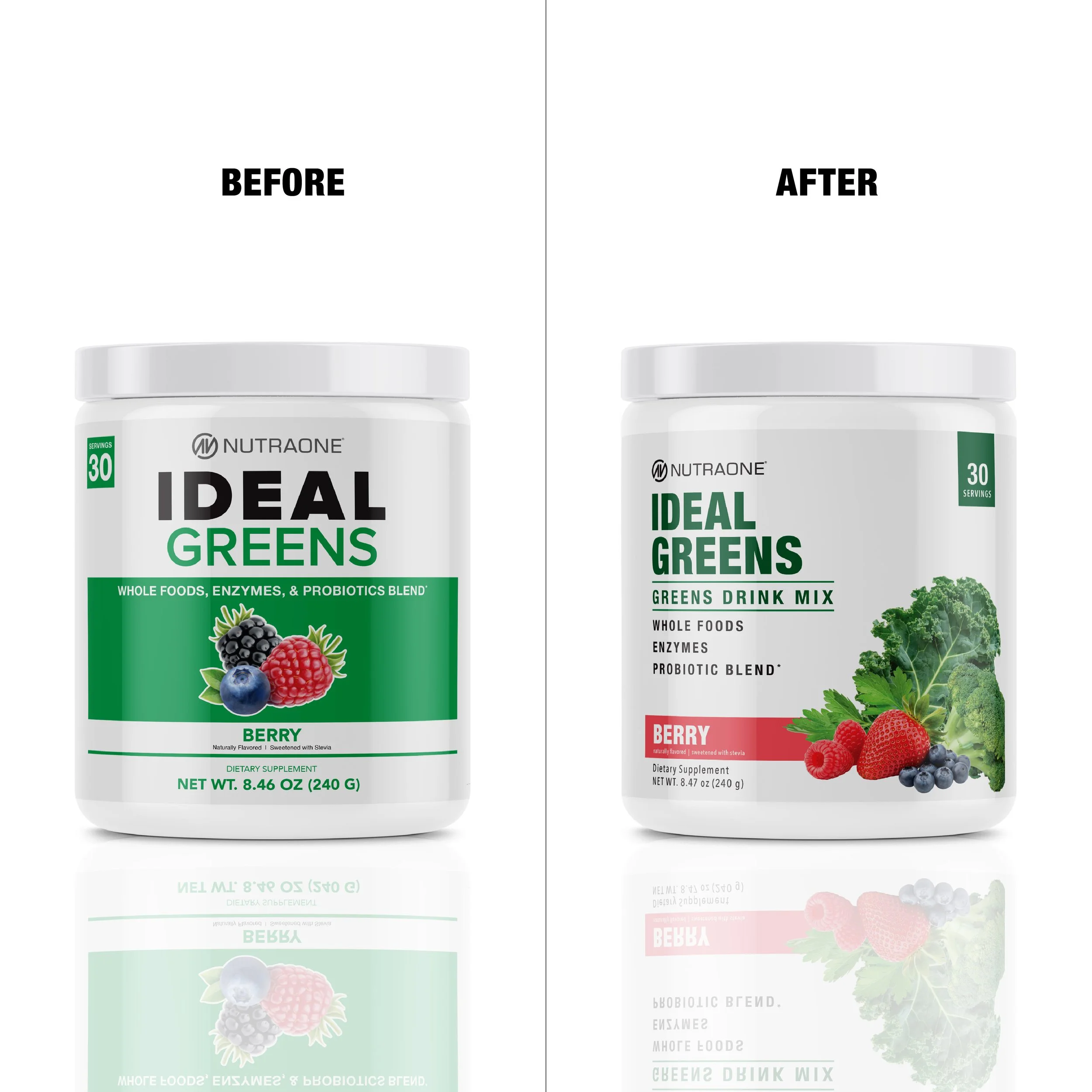
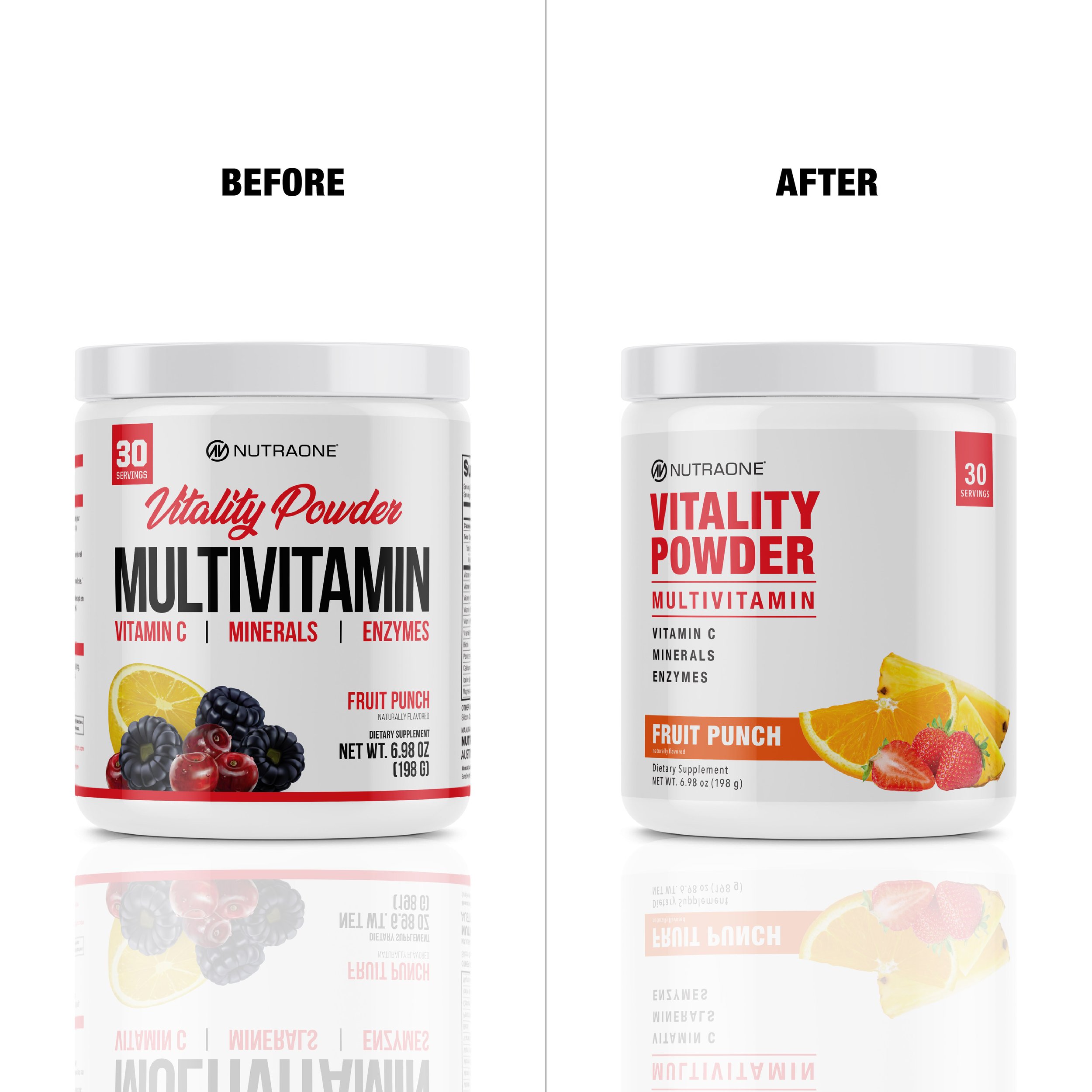
Our wellness products needed a bit of a refresh, so I had fun reimagining these labels and giving them an updated look, while still keeping them cohesively designed to fit the NutraOne style.
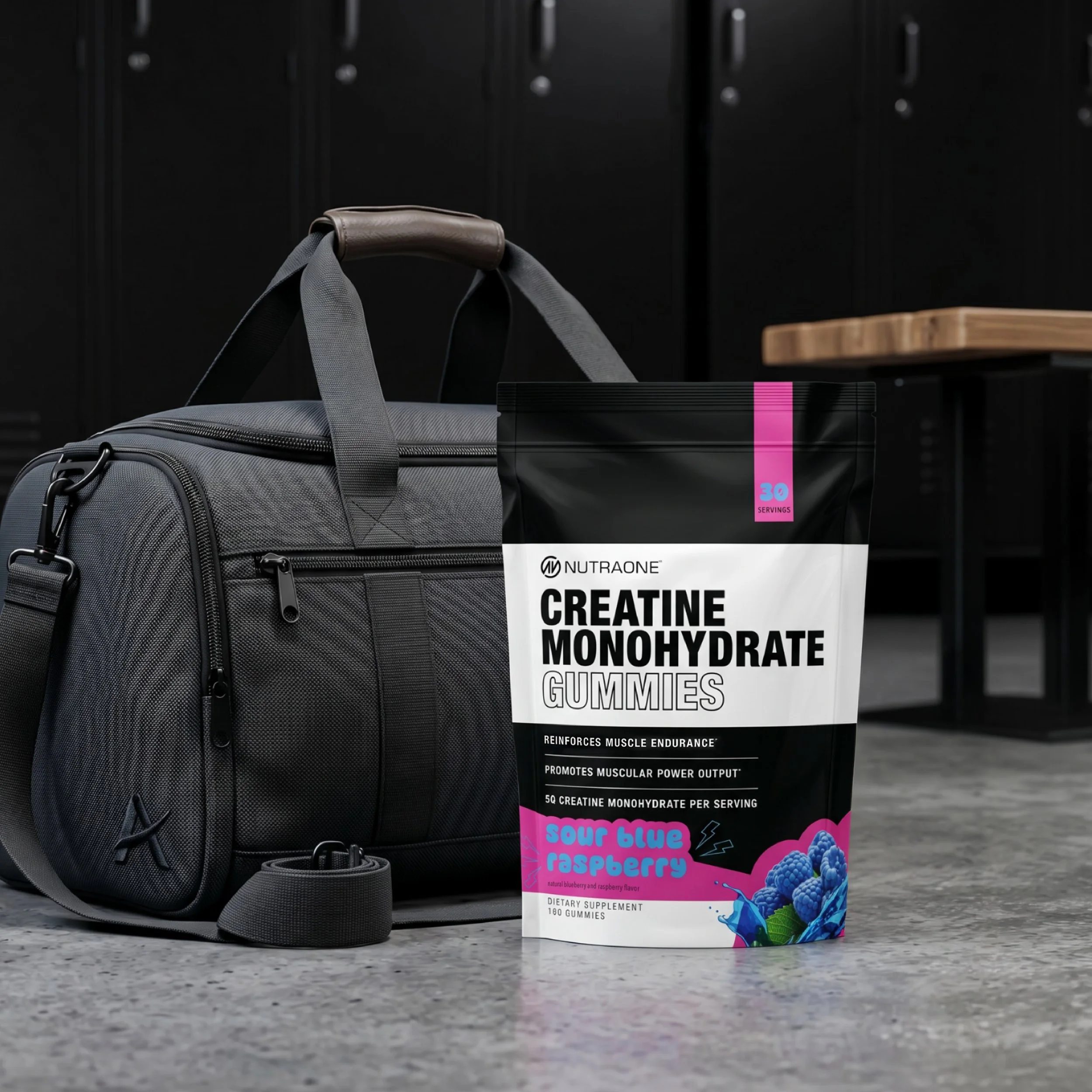
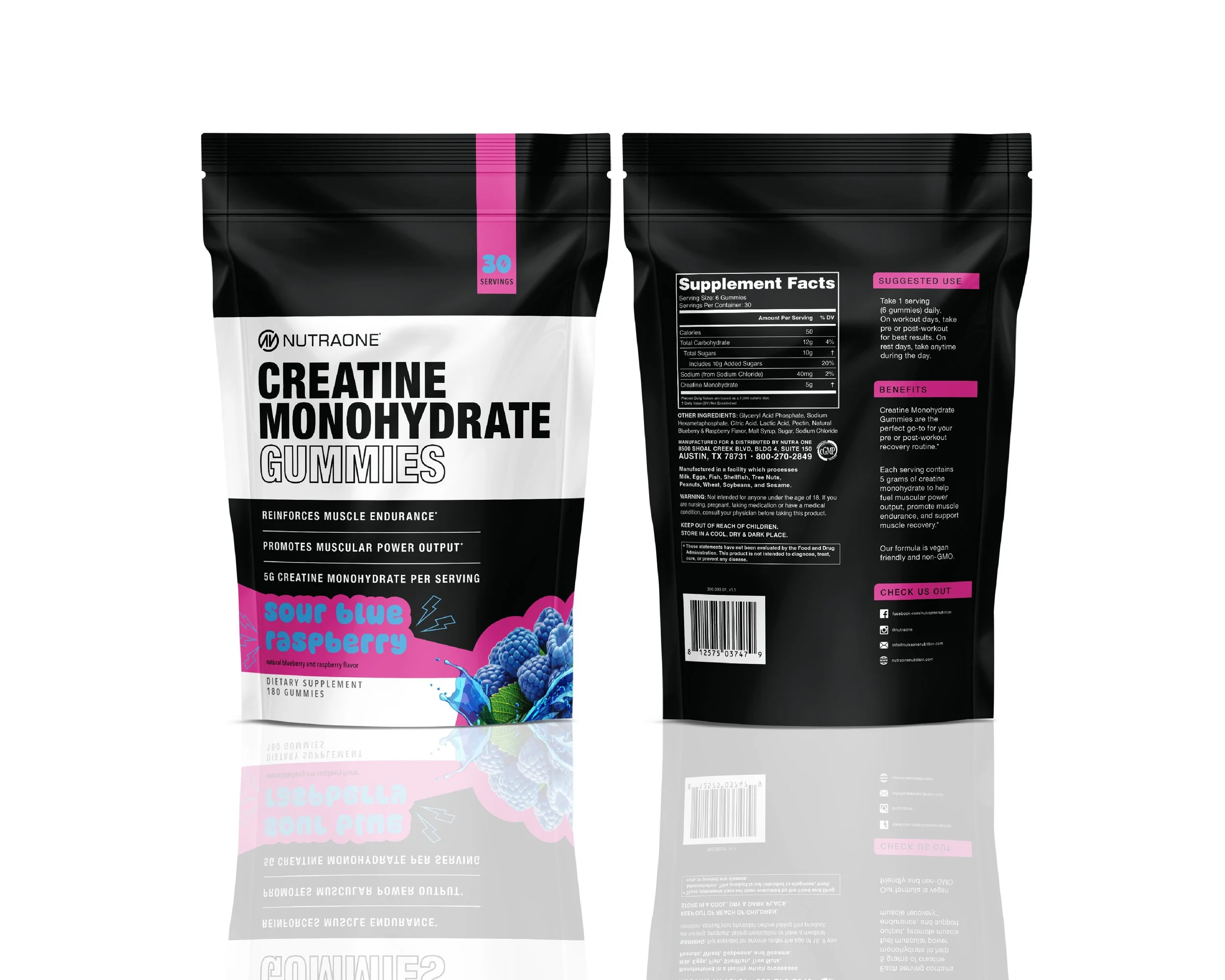
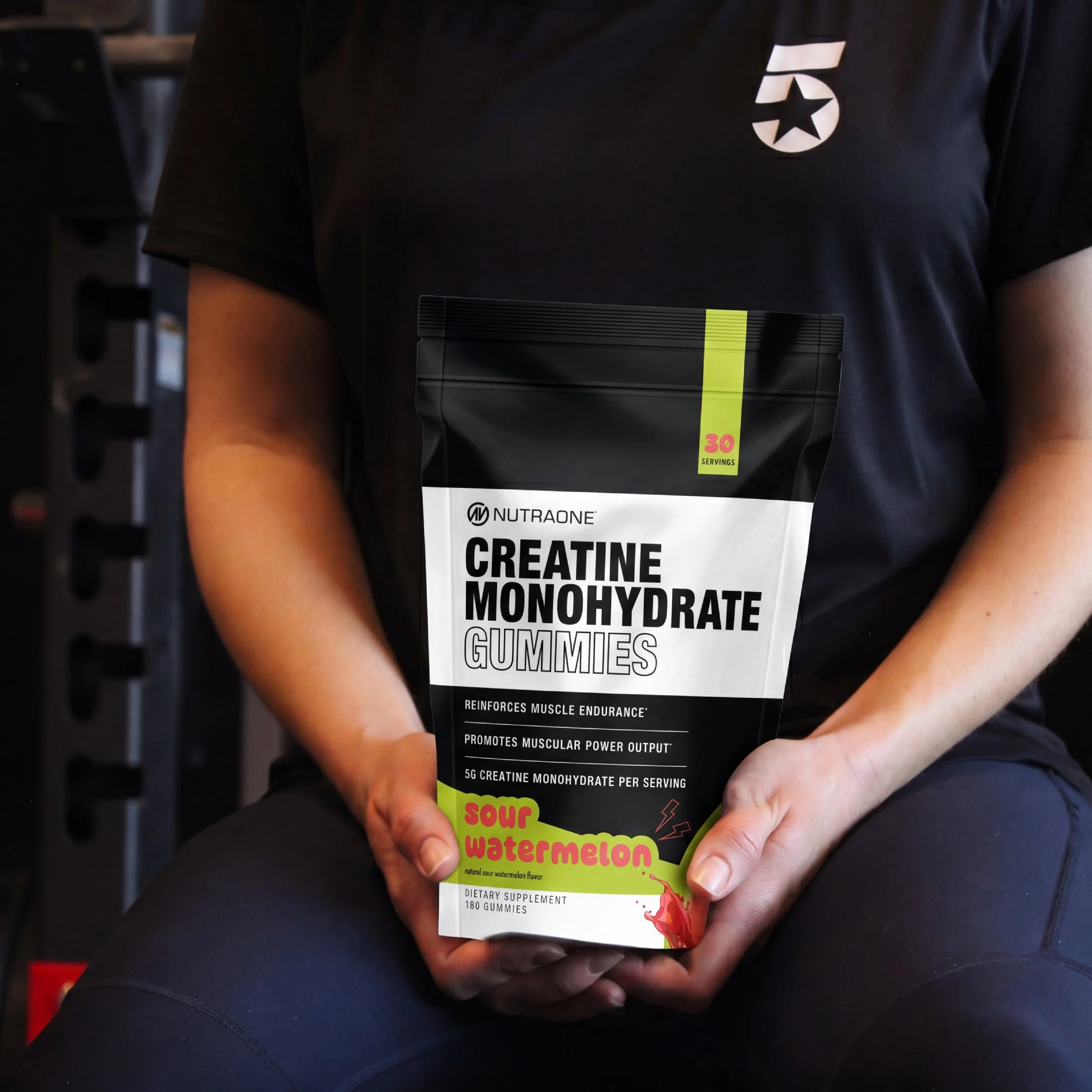
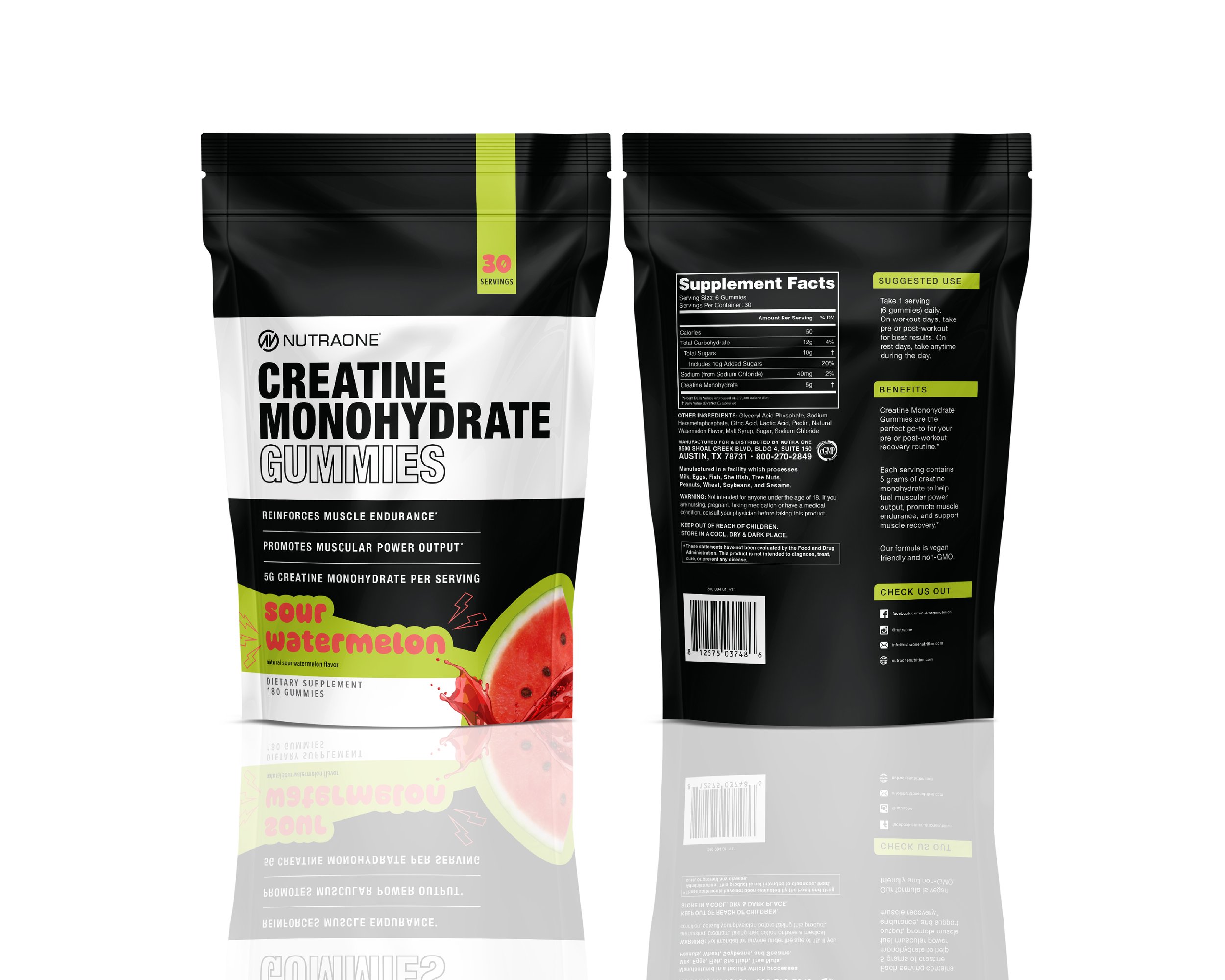
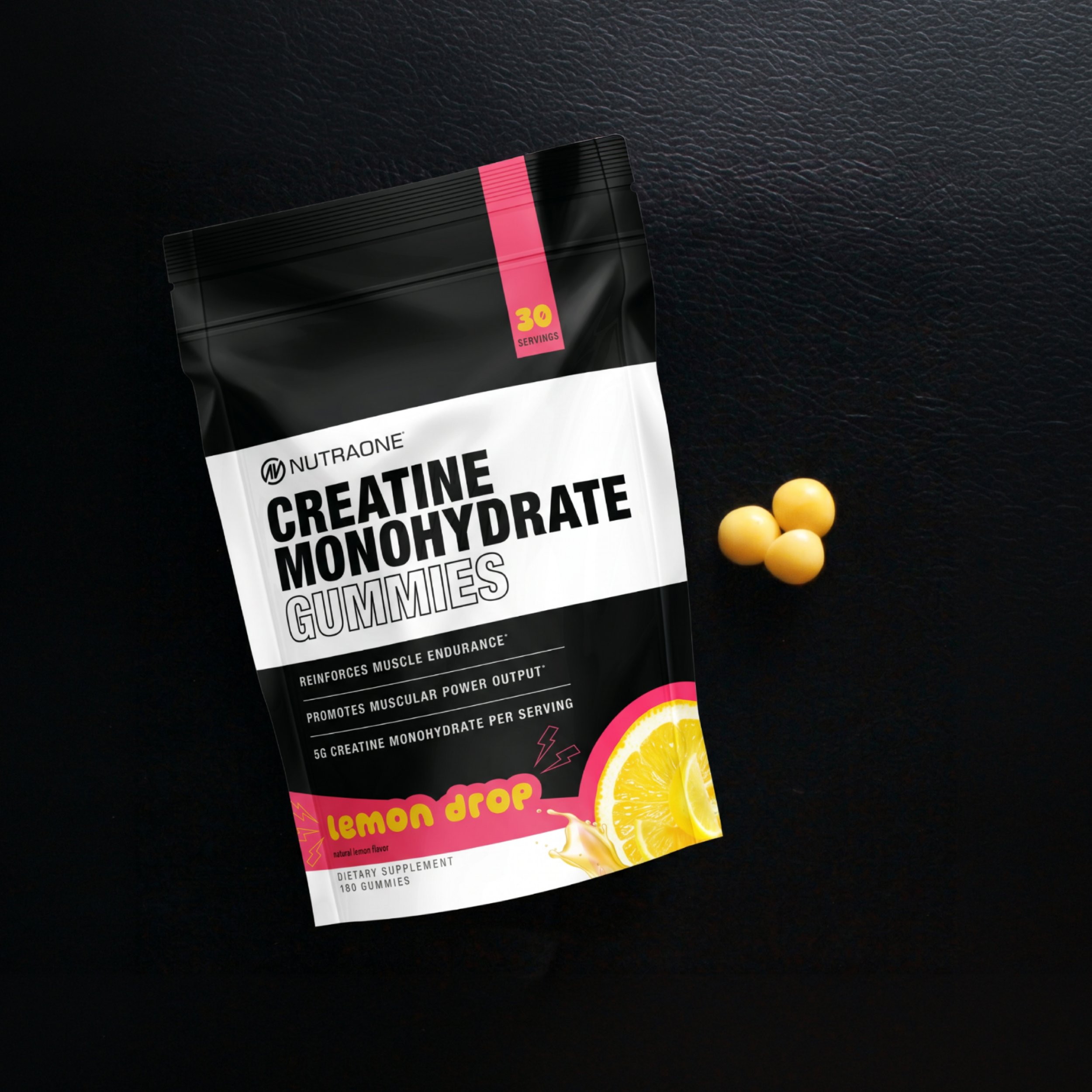
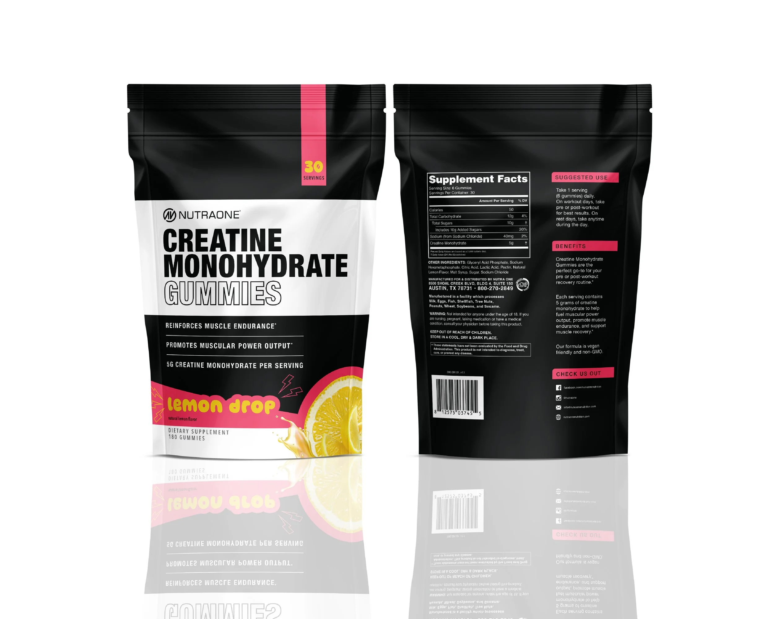
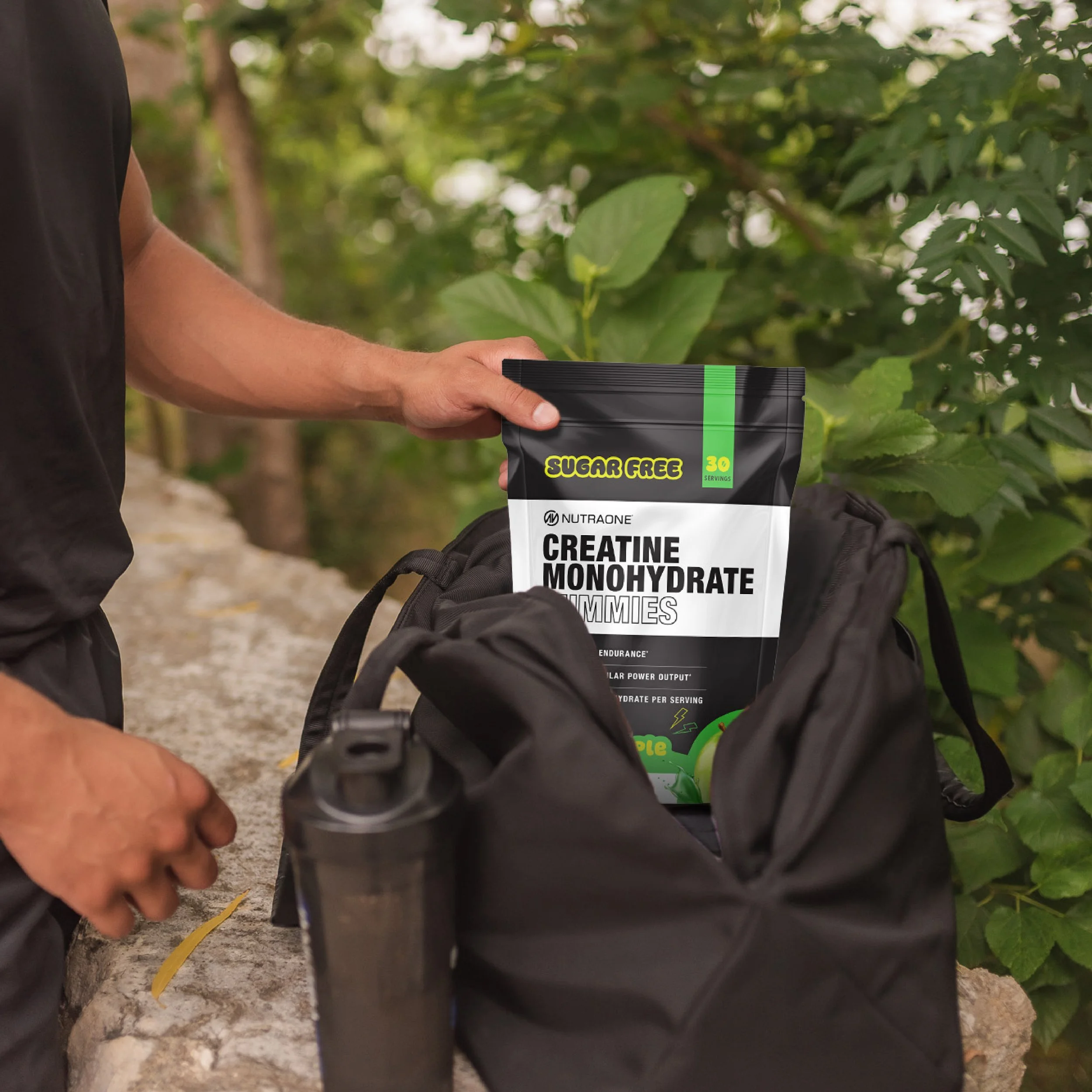
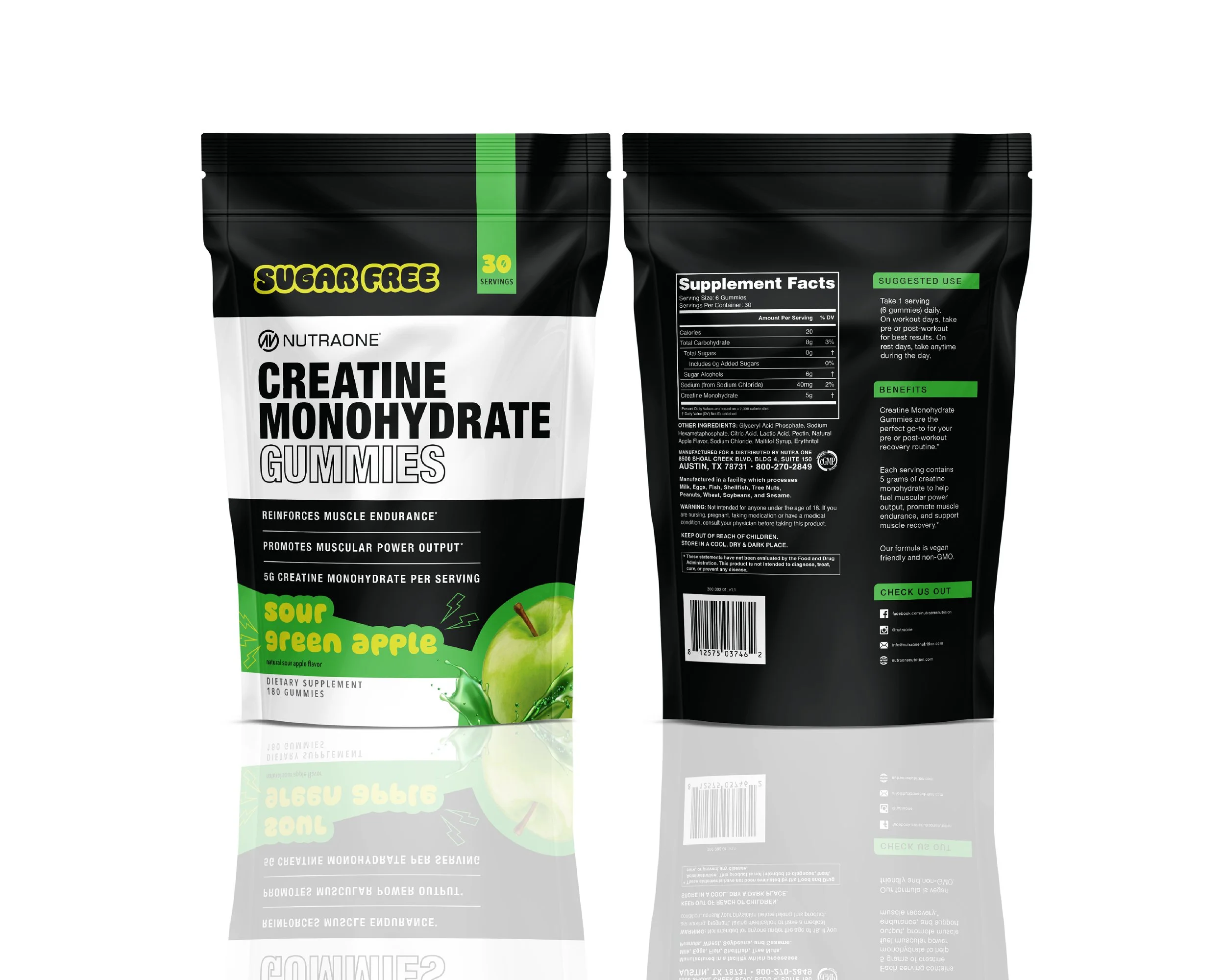
We added a new gummy version of creatine to our NutraOne lineup, and I got to design the packaging for these stand-up pouches. There were 4 flavors and they were all sour, so I enjoyed playing with color and shapes to really amp up the sour element on these bags.
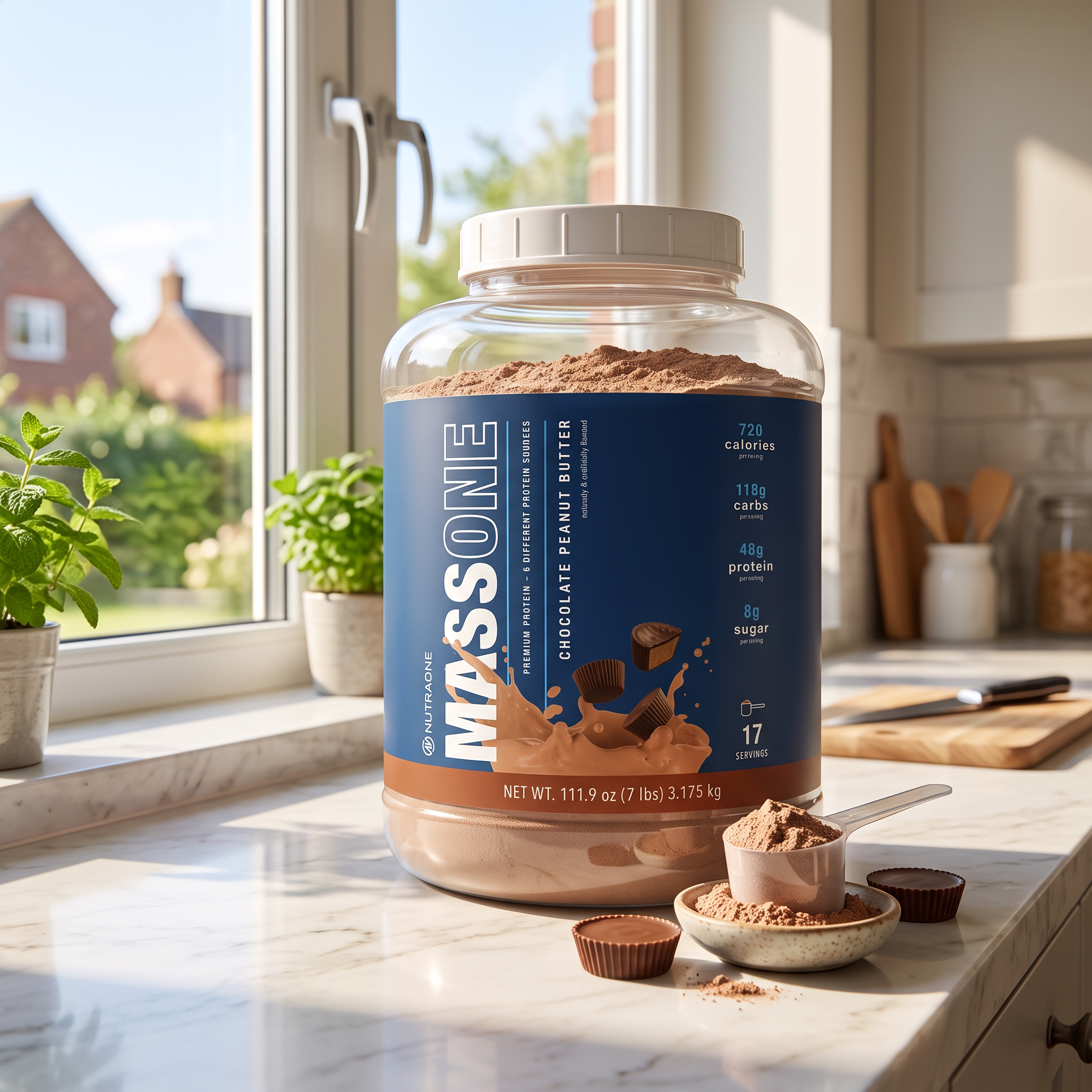
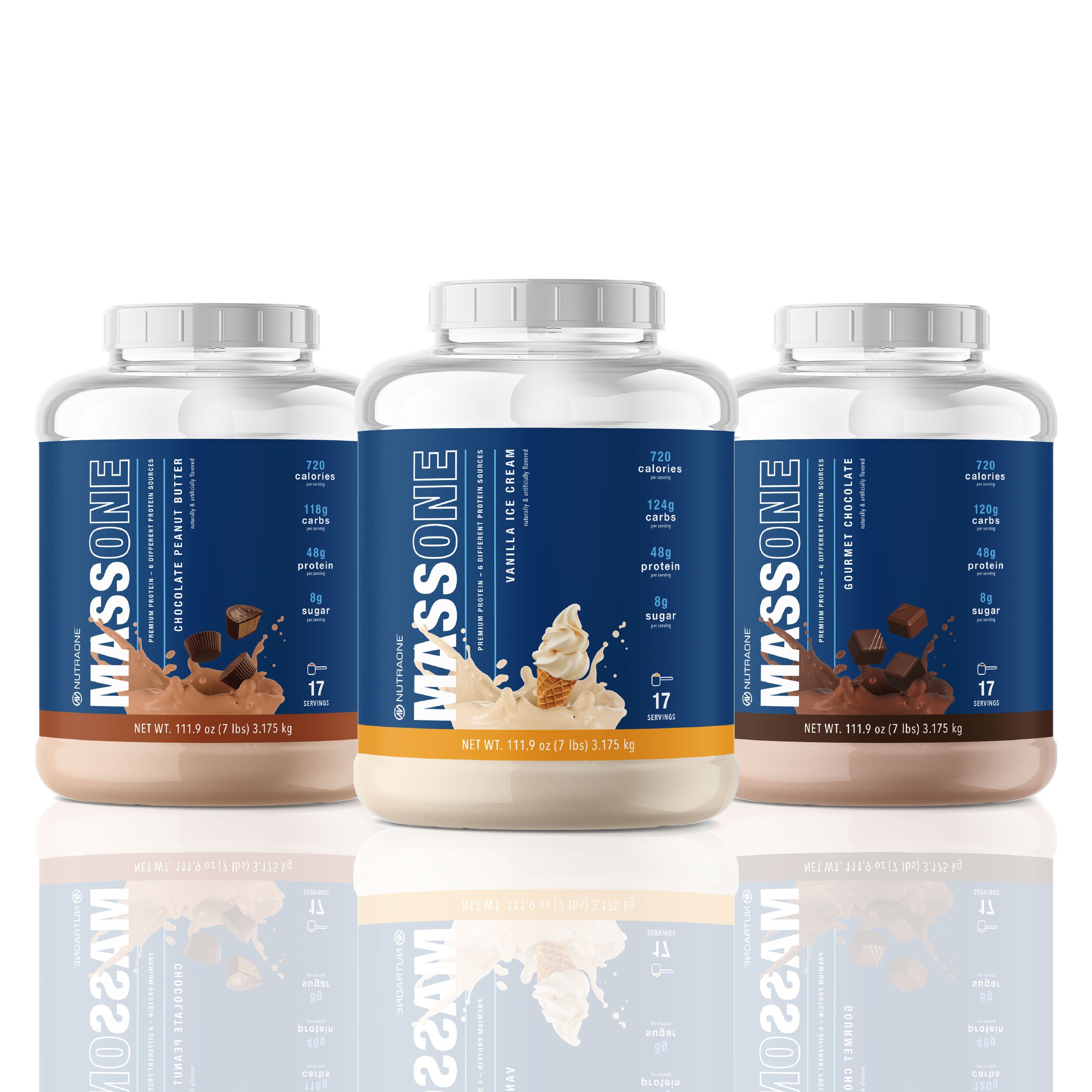
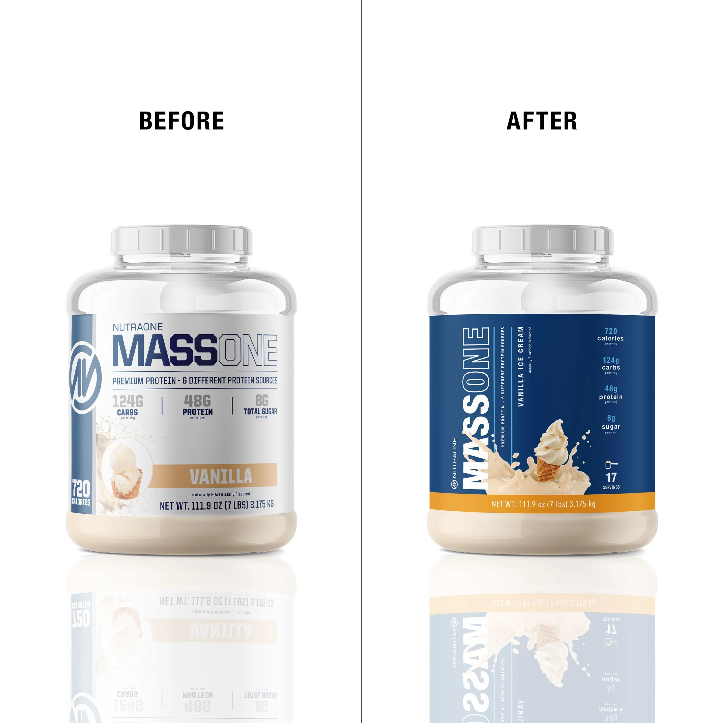
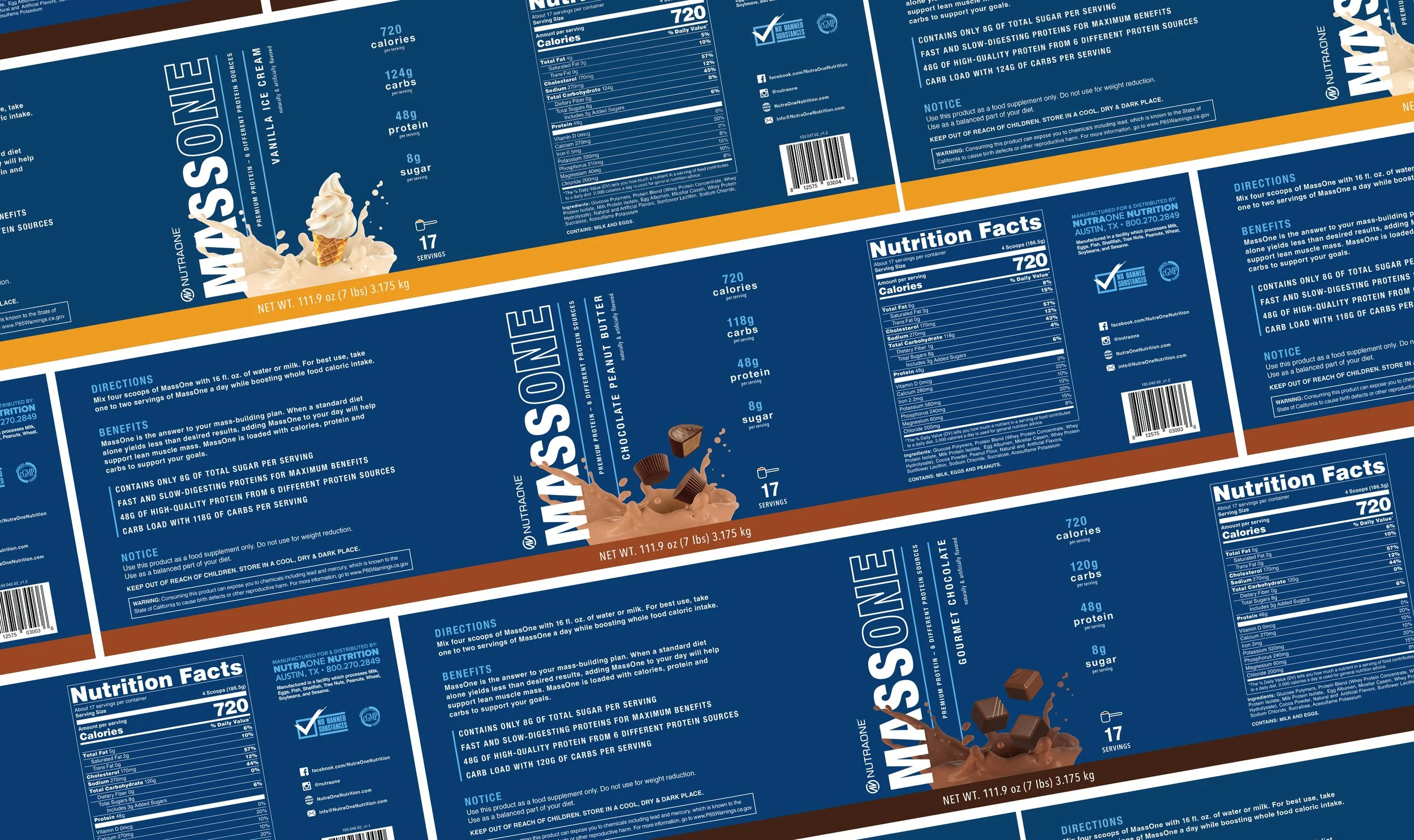
After the IsolateOne label update turned out so well, I was excited to apply a similar update to MassOne. I wanted it to stand out from IsolateOne, so instead of a charcoal background, I used the existing blue color on the old label to use as the background color. This tied it in nicely with the NutraOne brand while also providing a fresh new look.
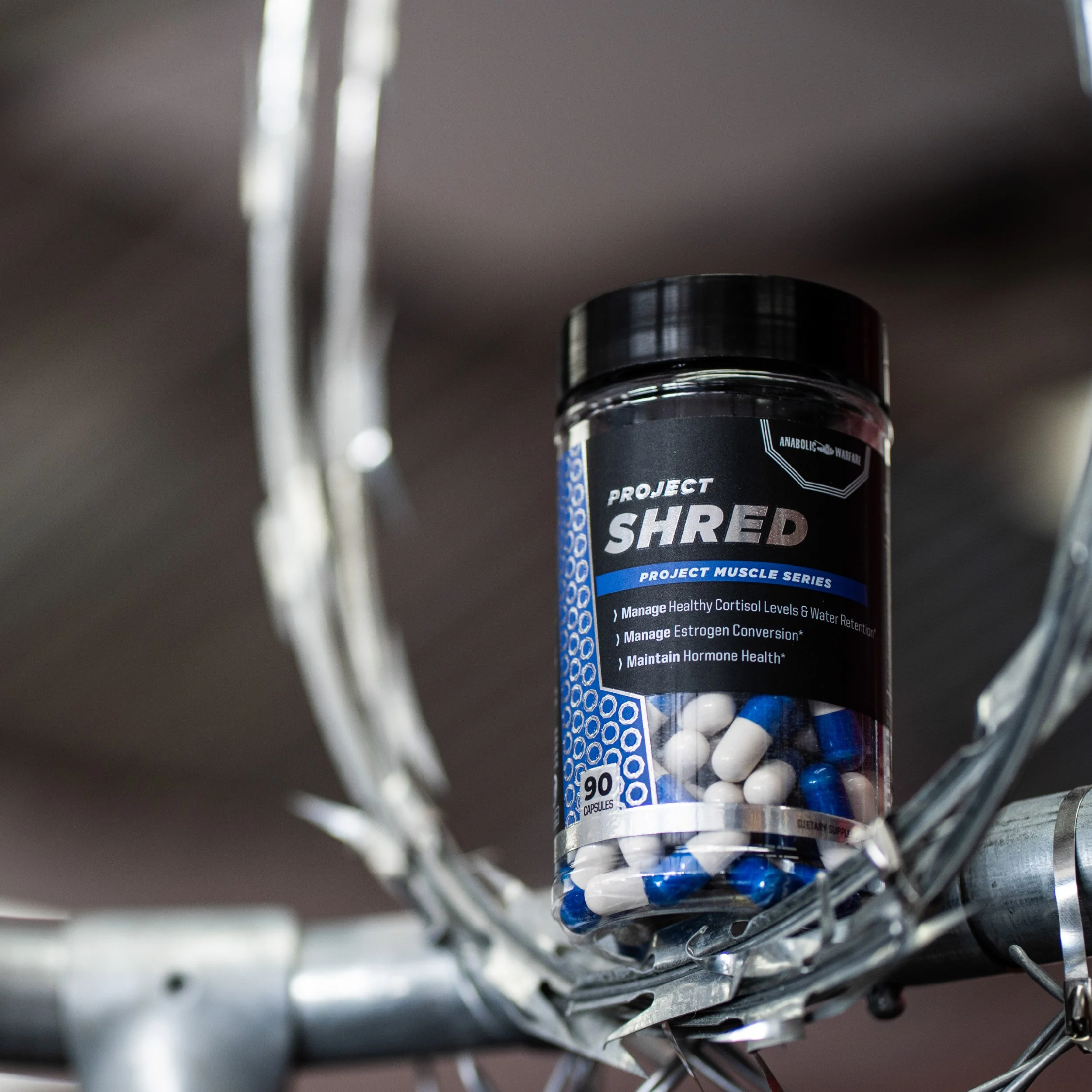
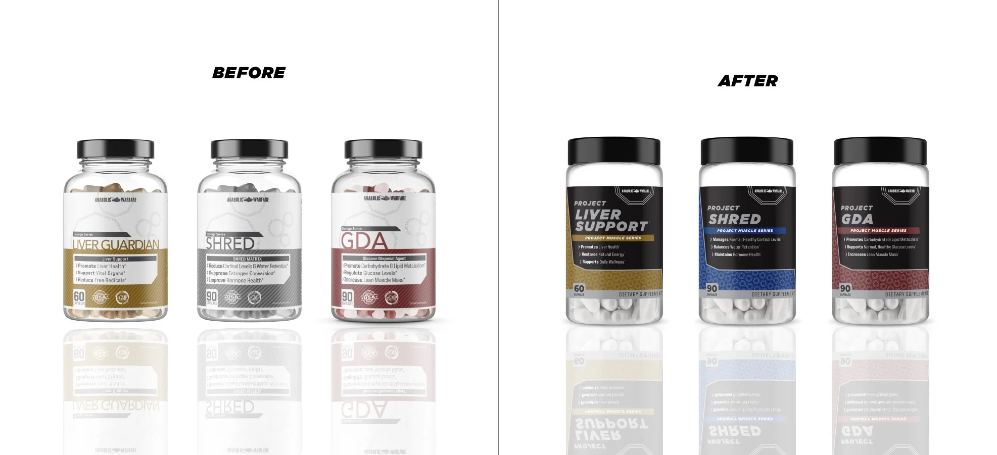
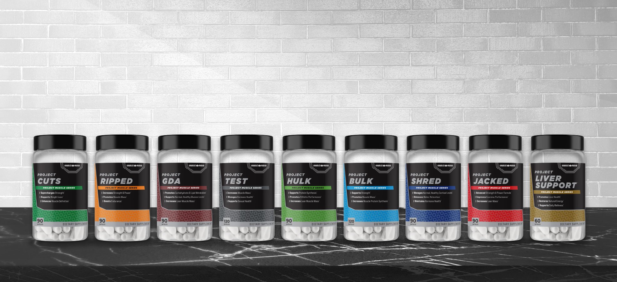
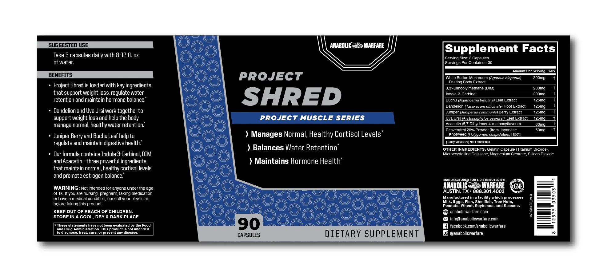
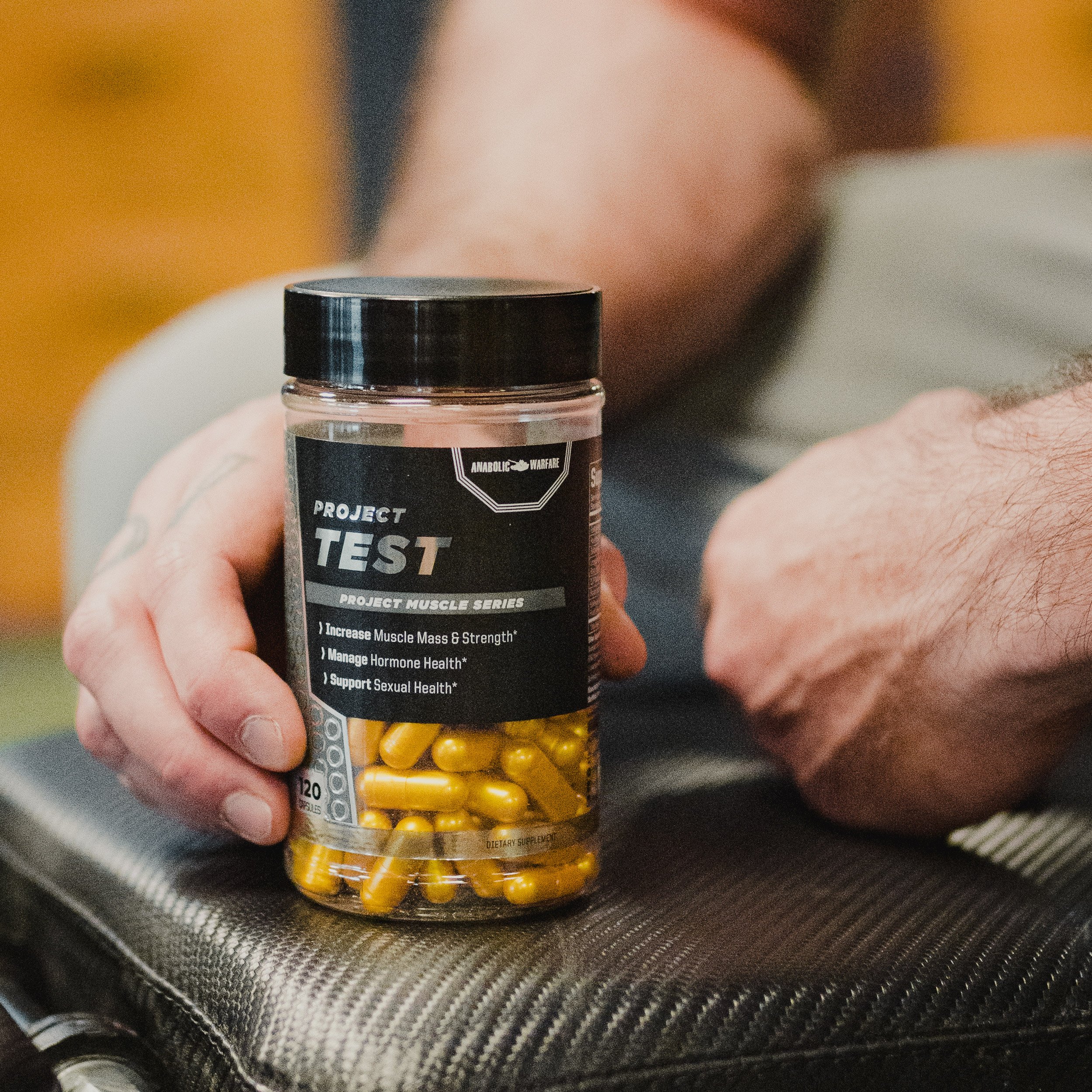
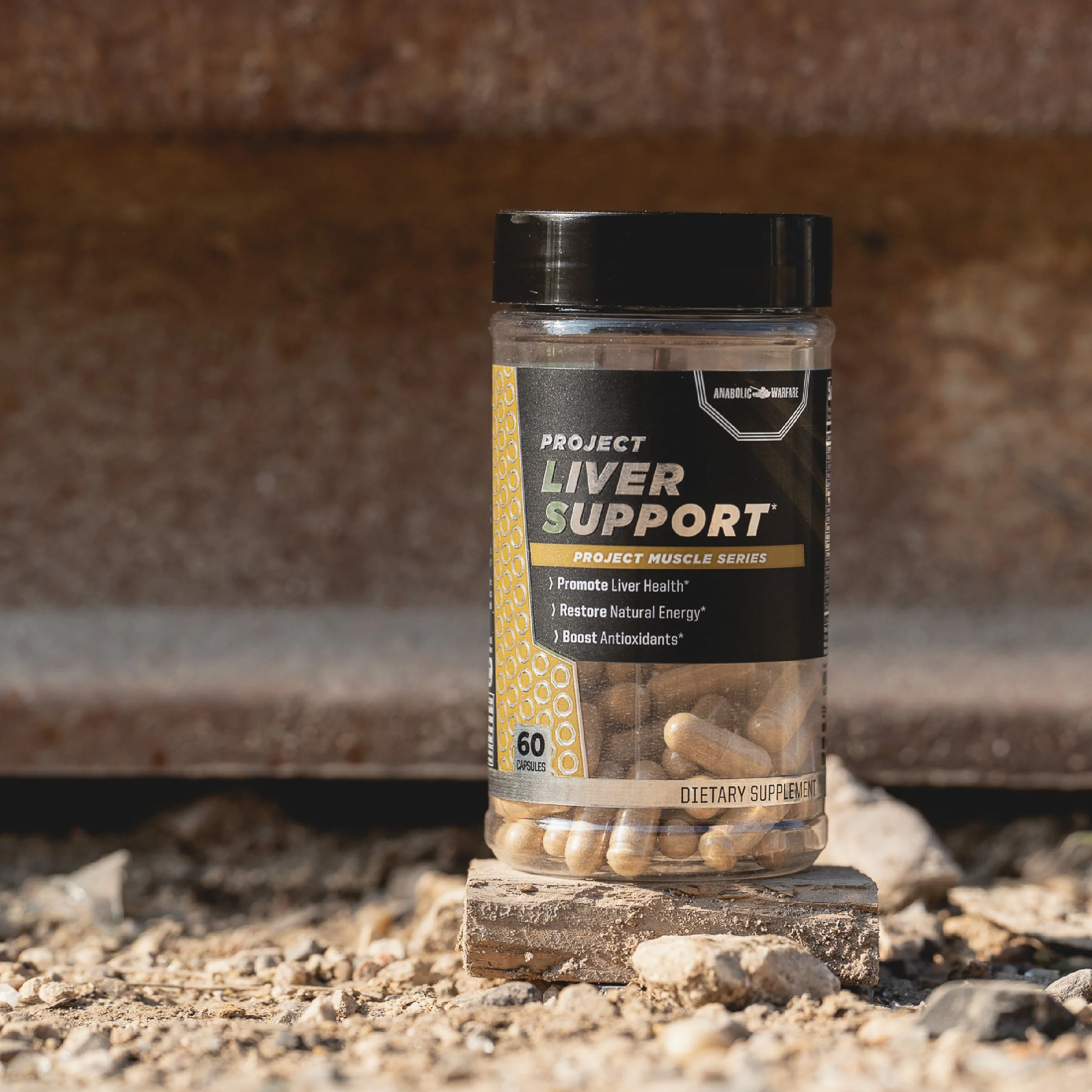
The company wanted to take some of their existing Anabolic Warfare products and add a few new ones to create this brand new line called the Project Muscle Series. The original idea was to have the pill colors correspond with the labels, which was very eye-catching through the window feature on the front of the bottle (as seen in the photos). We later removed the artificial colors from the pills and closed up the window. The matte finish and the metallic silver elements also elevated this label.
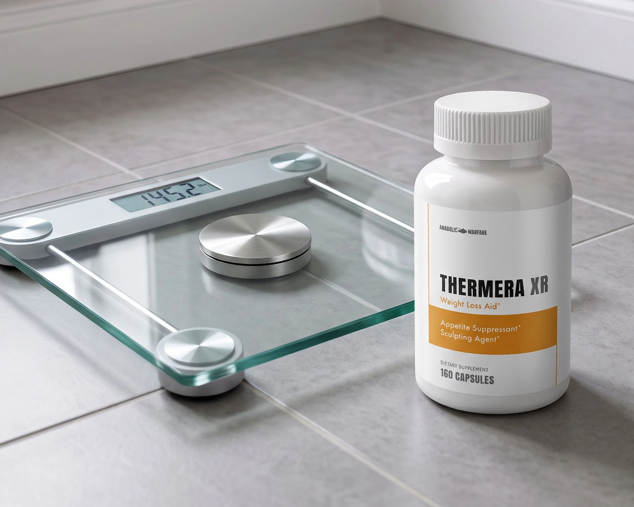
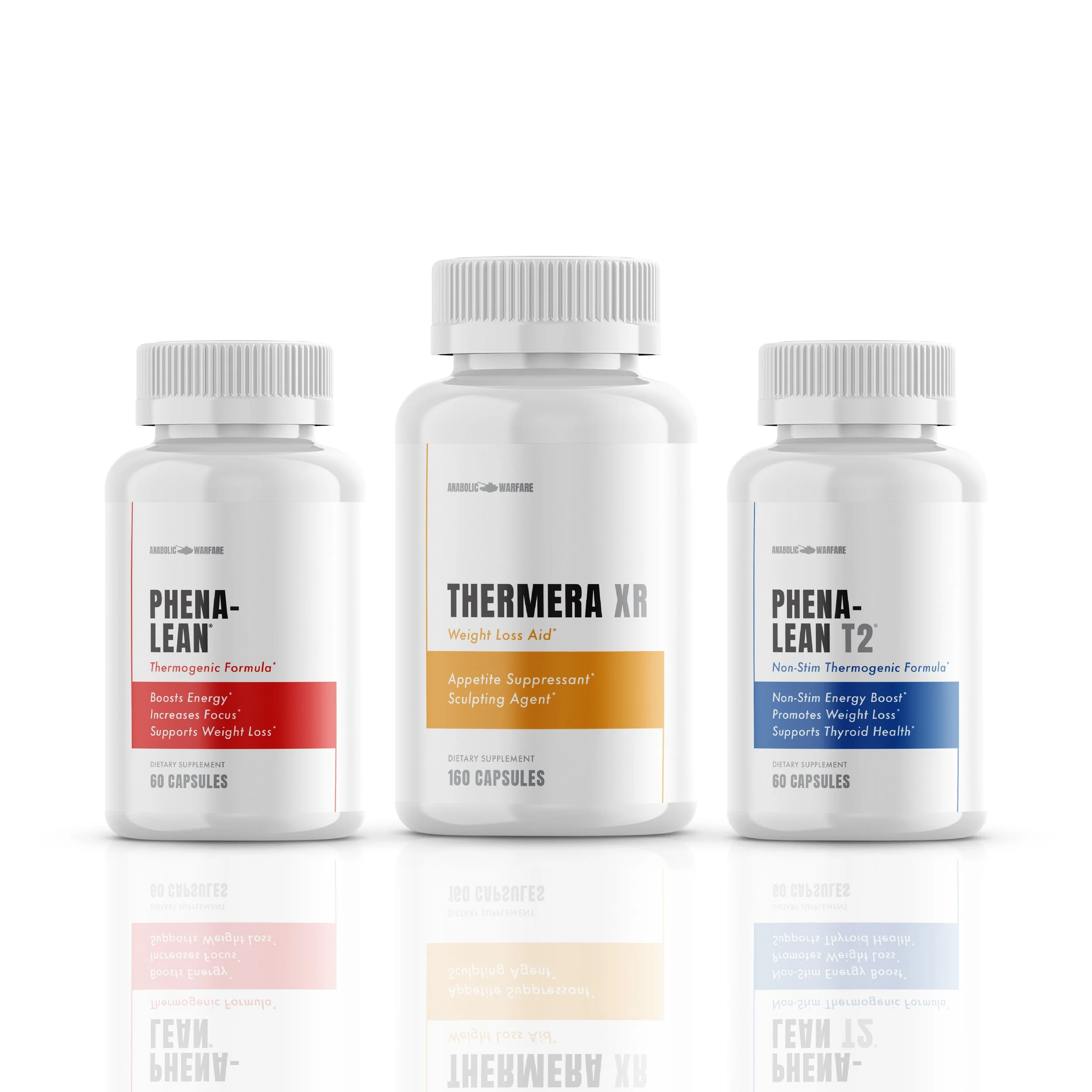
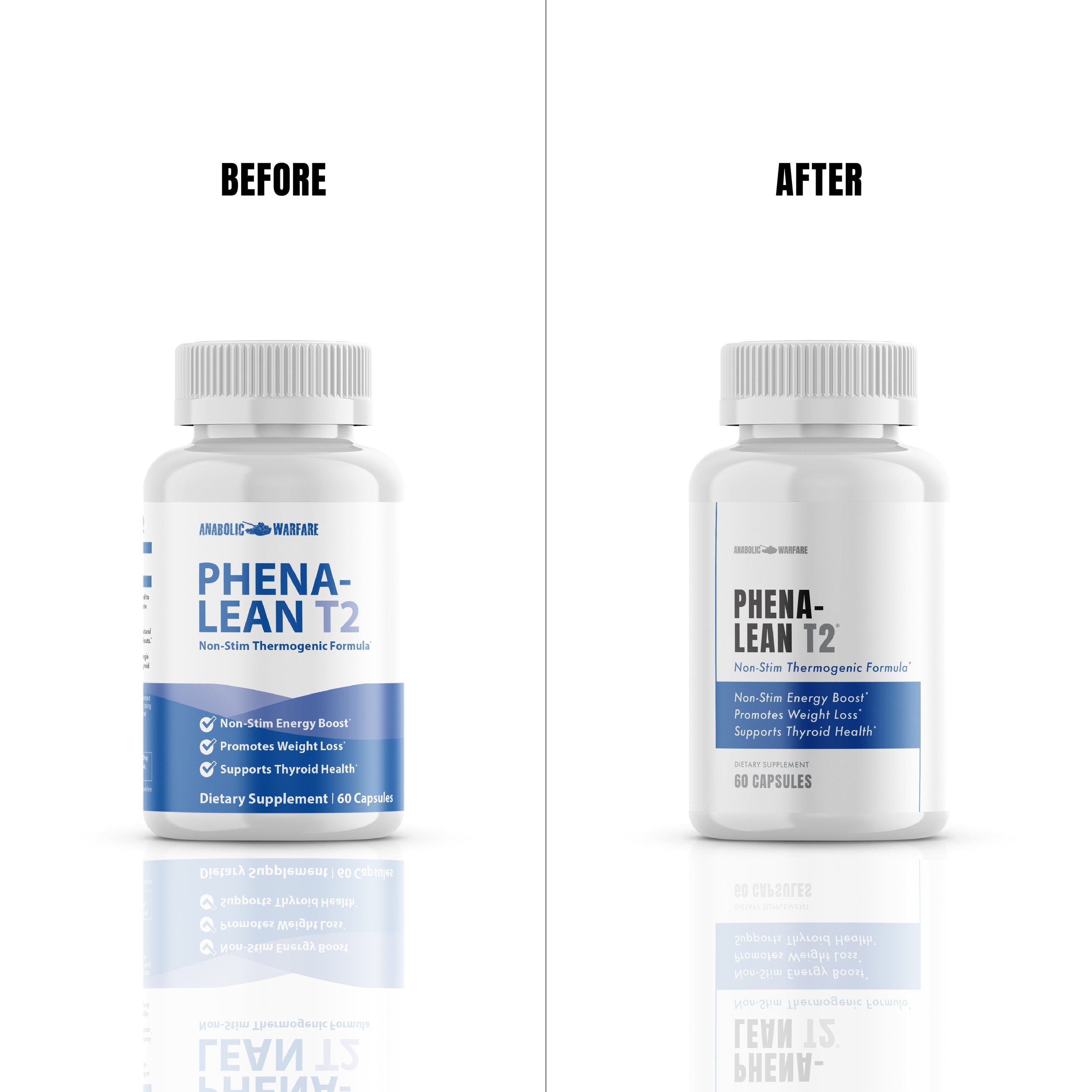
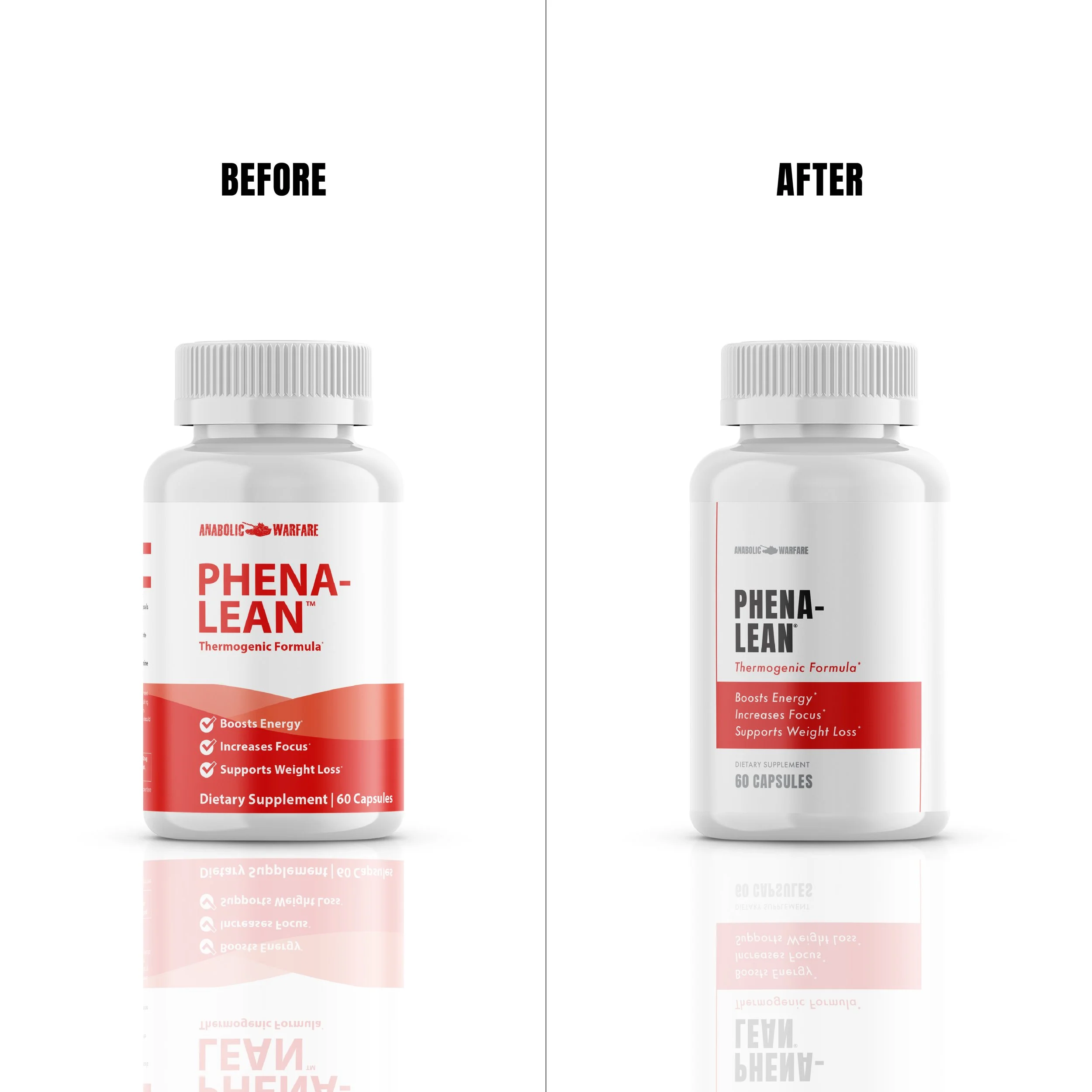
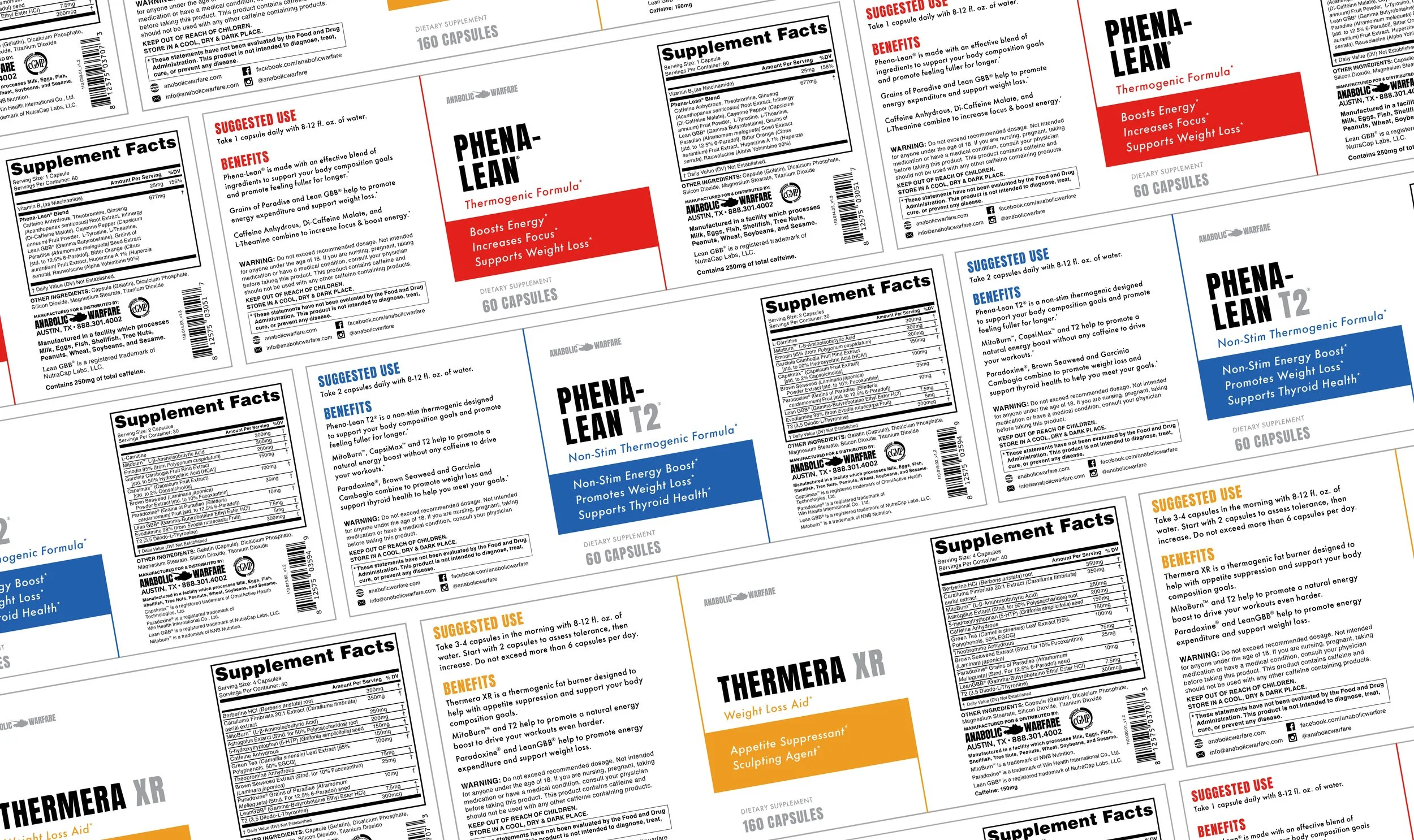
We had a new weight loss product to add to our line up, and I was tasked to create a clean, classic label to add to our Anabolic Warfare brand. The design was such a hit, I was then able to apply it to our other weight loss supplements, whose labels were needing a refresh, to create one cohesive line of fat burners.
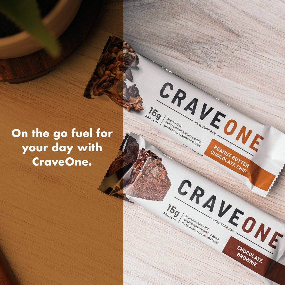
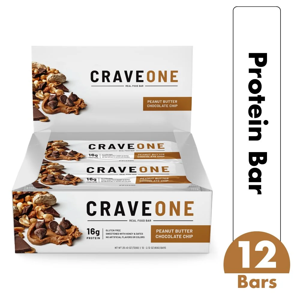
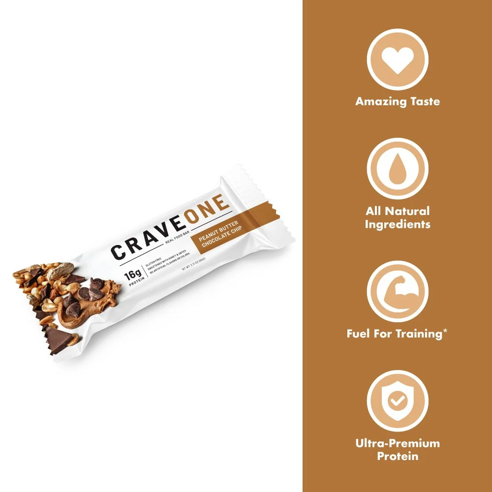
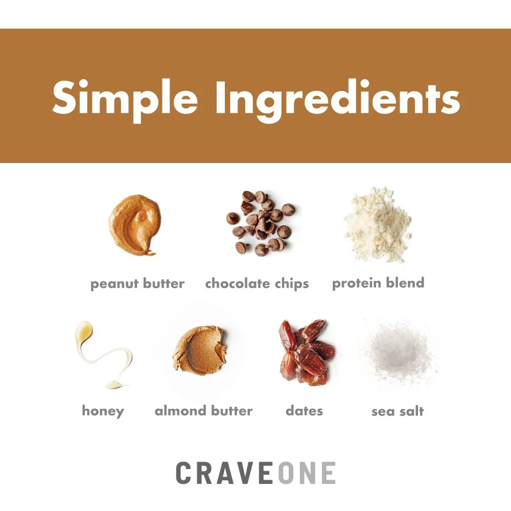
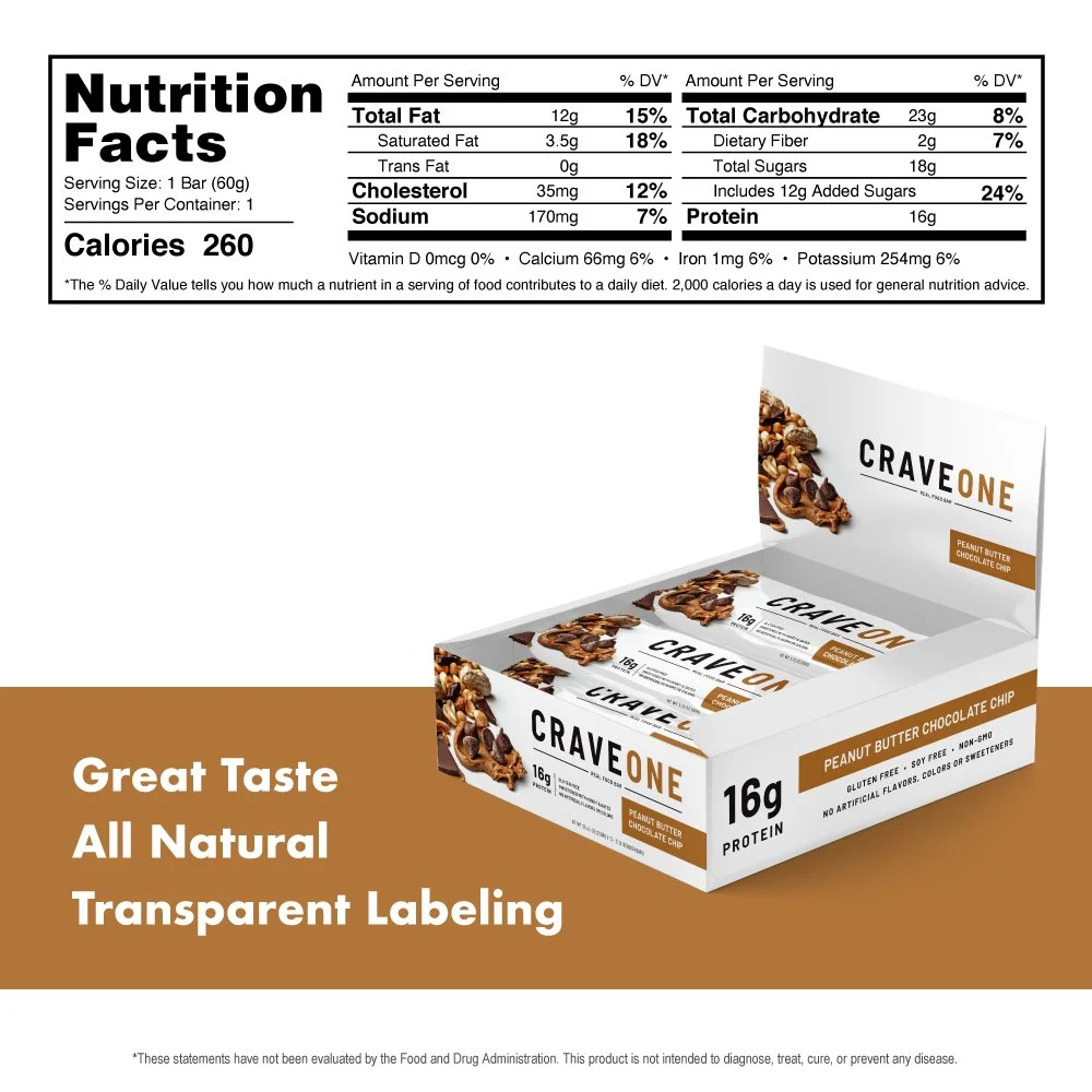
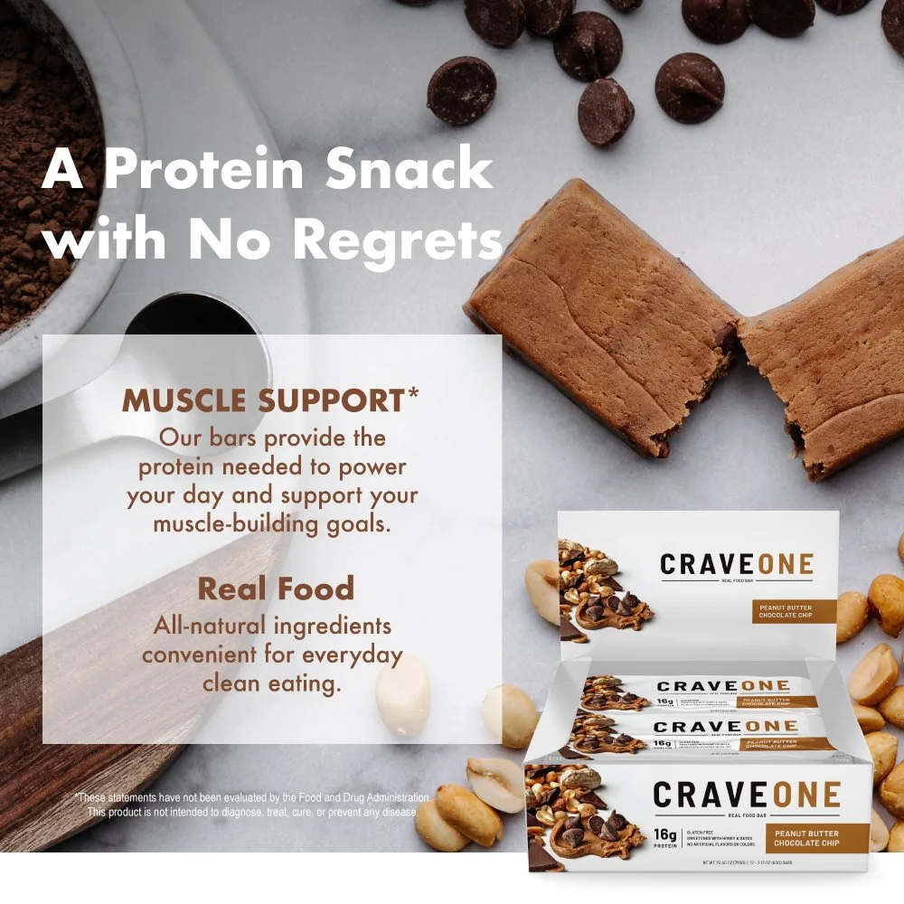
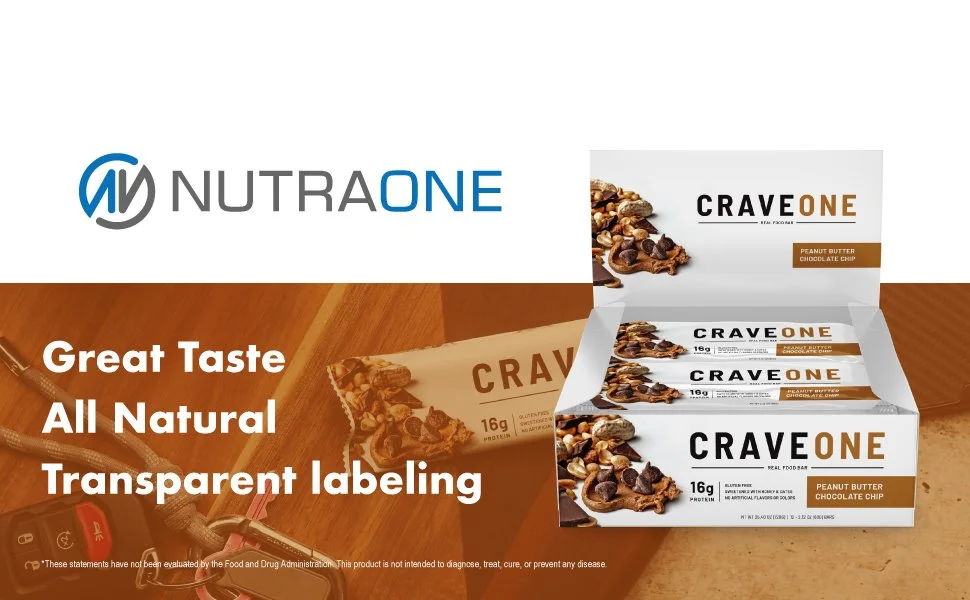
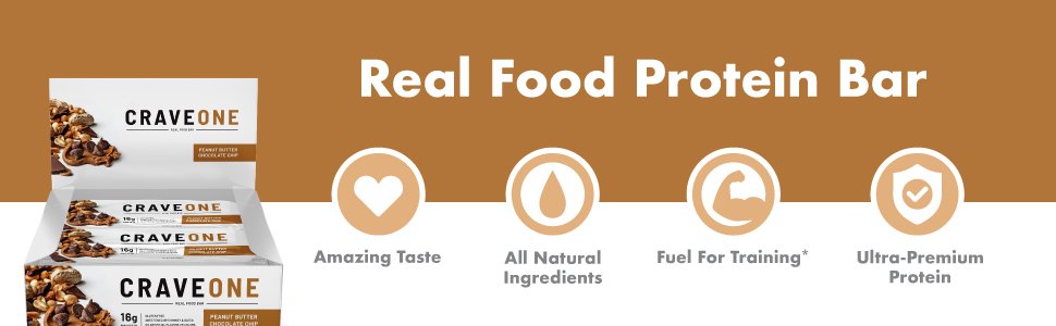
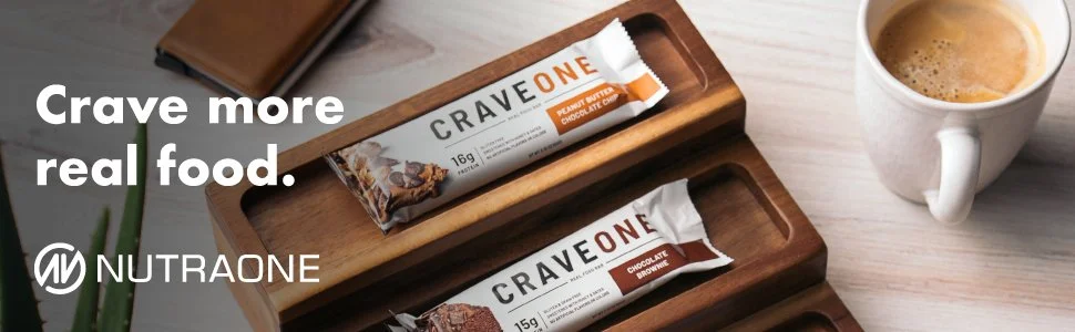
This was a protein bar we produced and I got to design the packaging for both flavors, including the wrapper and boxes. This was my first time designing packaging for a food item and it was a lot of fun. The name CraveOne tied into our brand NutraOne, and the packaging was modern, stylish, and mouthwatering.